
2026
Lesening Mengya
Entrant
Shanghai GICO Brand Incubation & Creative Design Co., Ltd.
Category
Branded Content - Retail
Client's Name
Country / Region
China
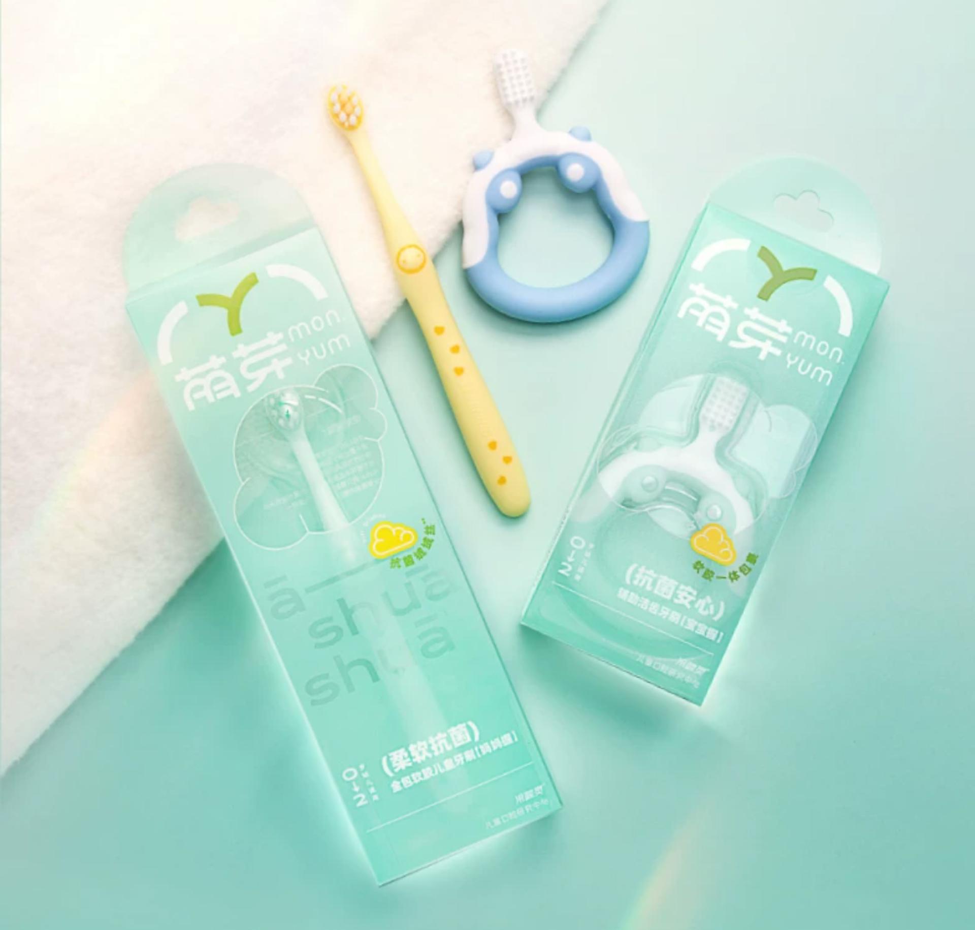
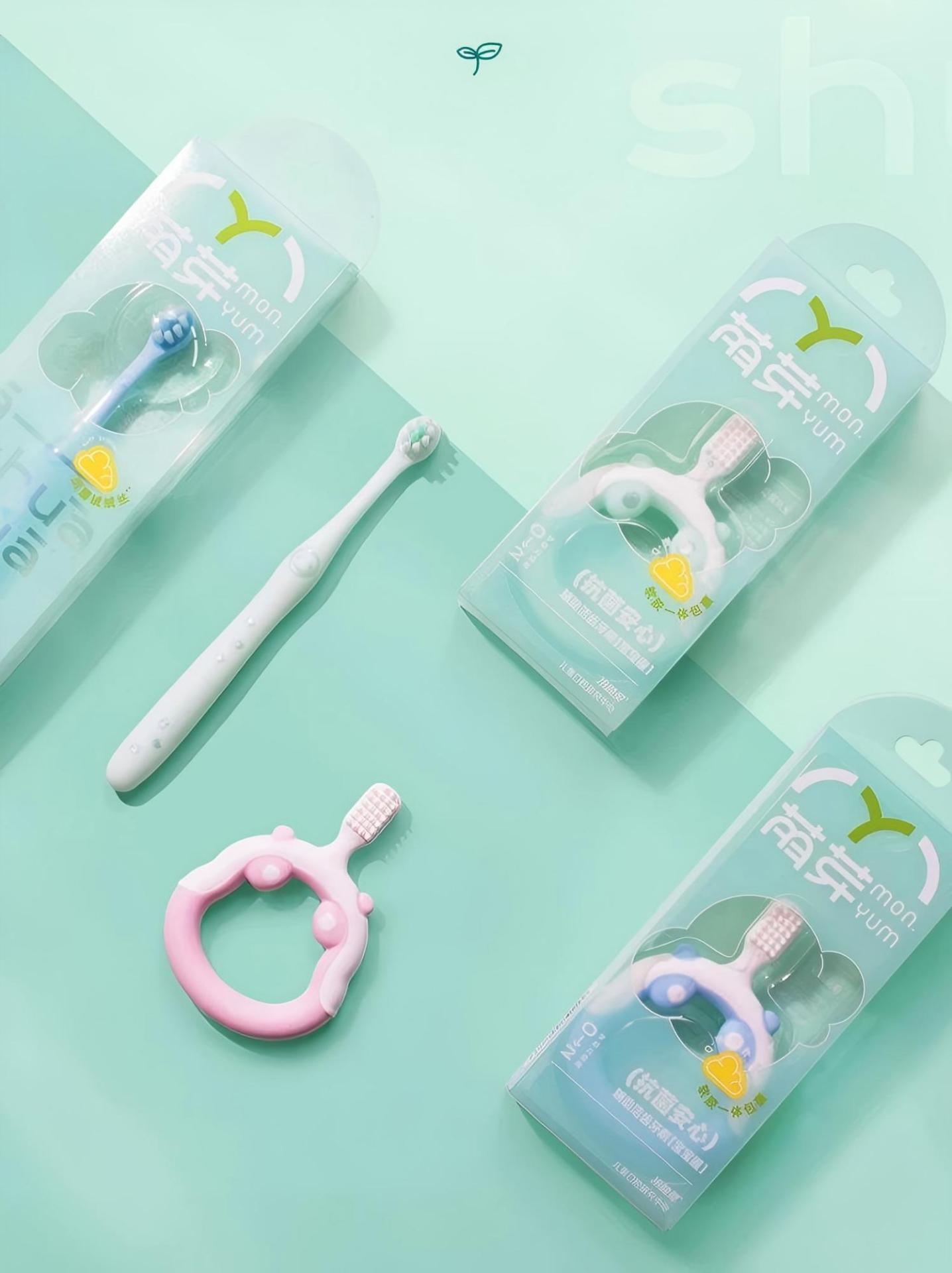
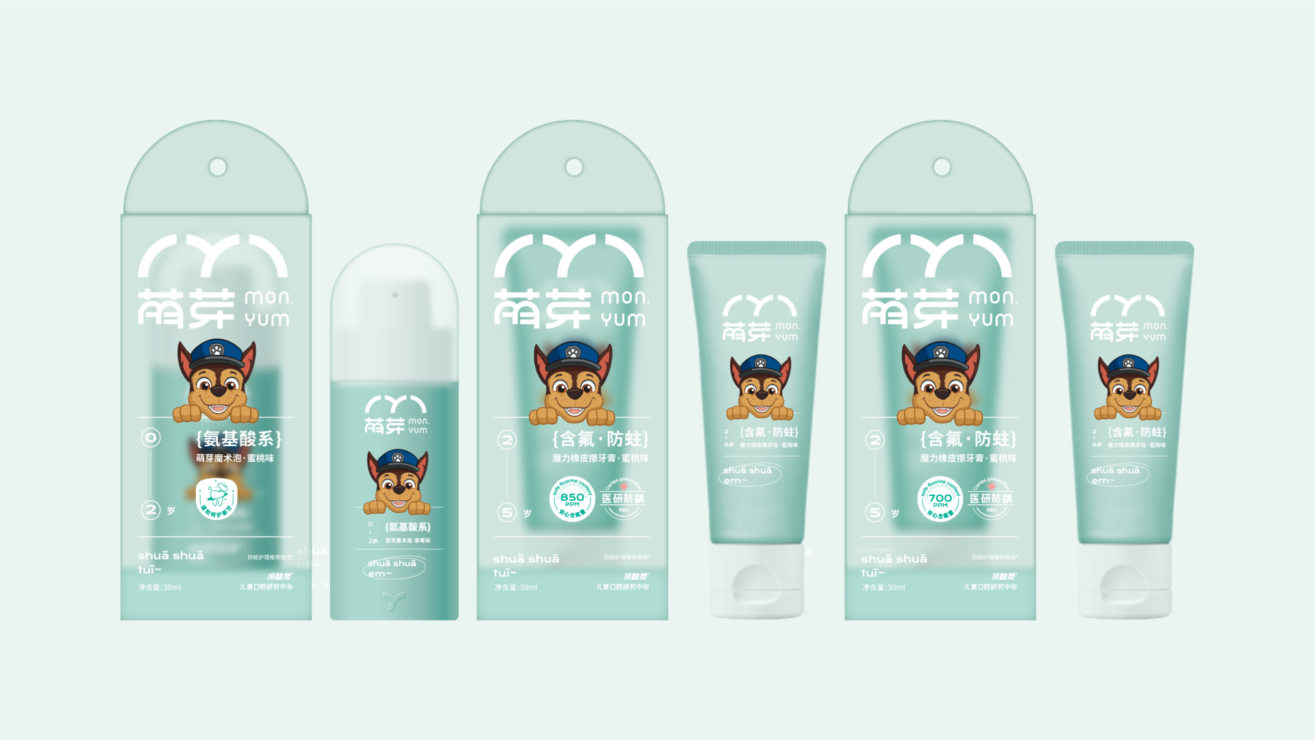
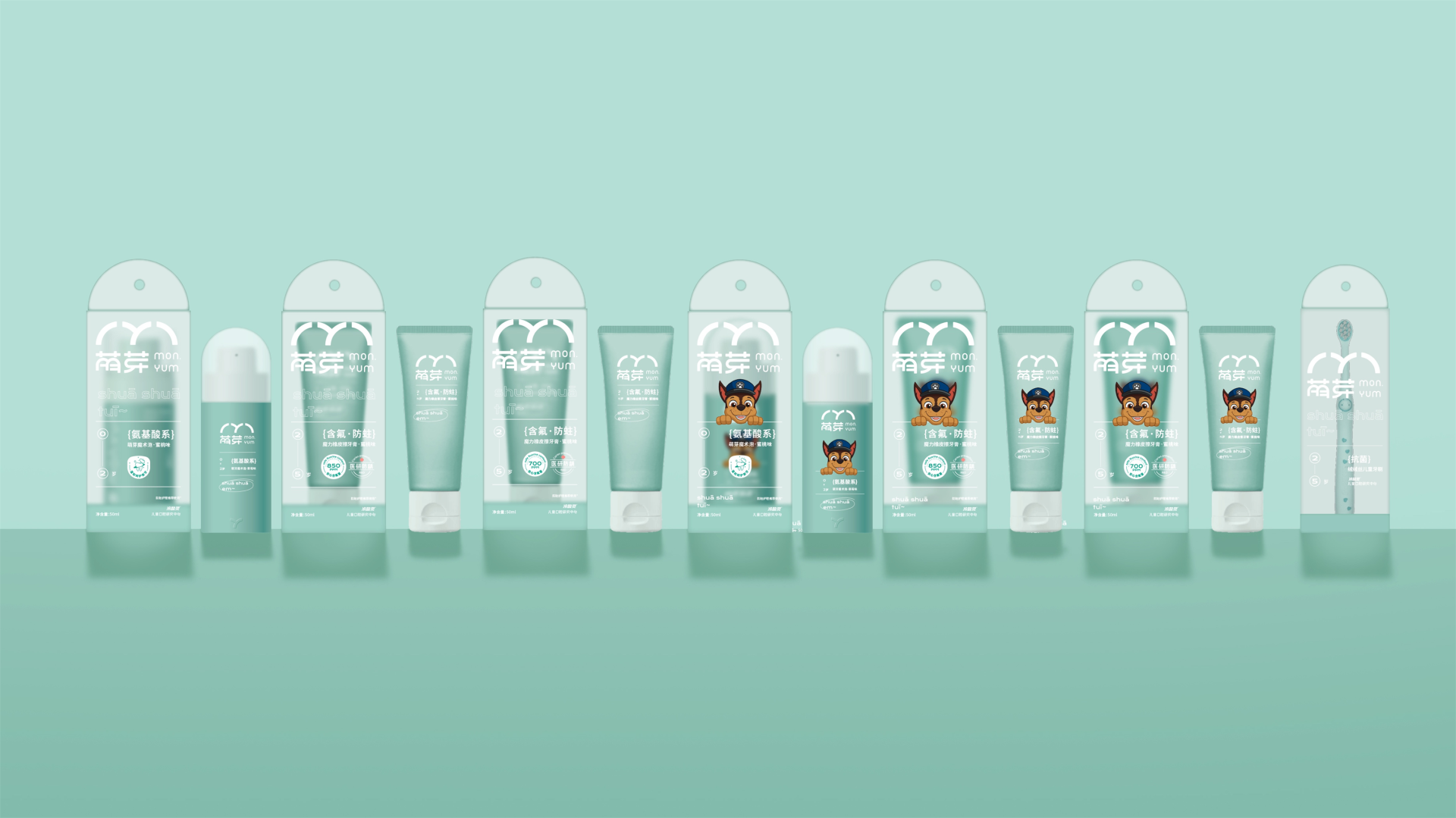
Lesening Mengya is a sub-brand of the nationally recognized oral care brand Lesening, specifically created for Chinese children aged 0 to 12 years. Its mission is to "safely care for the delicate oral ecosystem of young children from birth onward." In response to the unique characteristics of children's oral development and the widespread consumption of high-sugar diets, Mengya has established a sophisticated age-specific formulation system along with comprehensive safety protection technology that spans the entire growth cycle. For instance, during the primary teeth phase (ages 2 to 5), a low-fluoride formula (700 to 850 ppm) combined with soft abrasives is utilized to strike a balance between cavity prevention and enamel protection. In the mixed dentition phase (ages 5 to 12), a synergistic formula incorporating olaflur and hydroxyapatite is employed to enhance tooth mineralization and alleviate sensitivity. All products are devoid of harmful substances such as sucrose, alcohol, artificial colors, and parabens. The sweeteners incorporated are natural xylitol and erythritol, which are non-cariogenic and impart a refreshing taste. Furthermore, more than 10 billion freeze-dried active probiotics are included to regulate oral microbiota, inhibit cariogenic bacteria, and promote gum health.
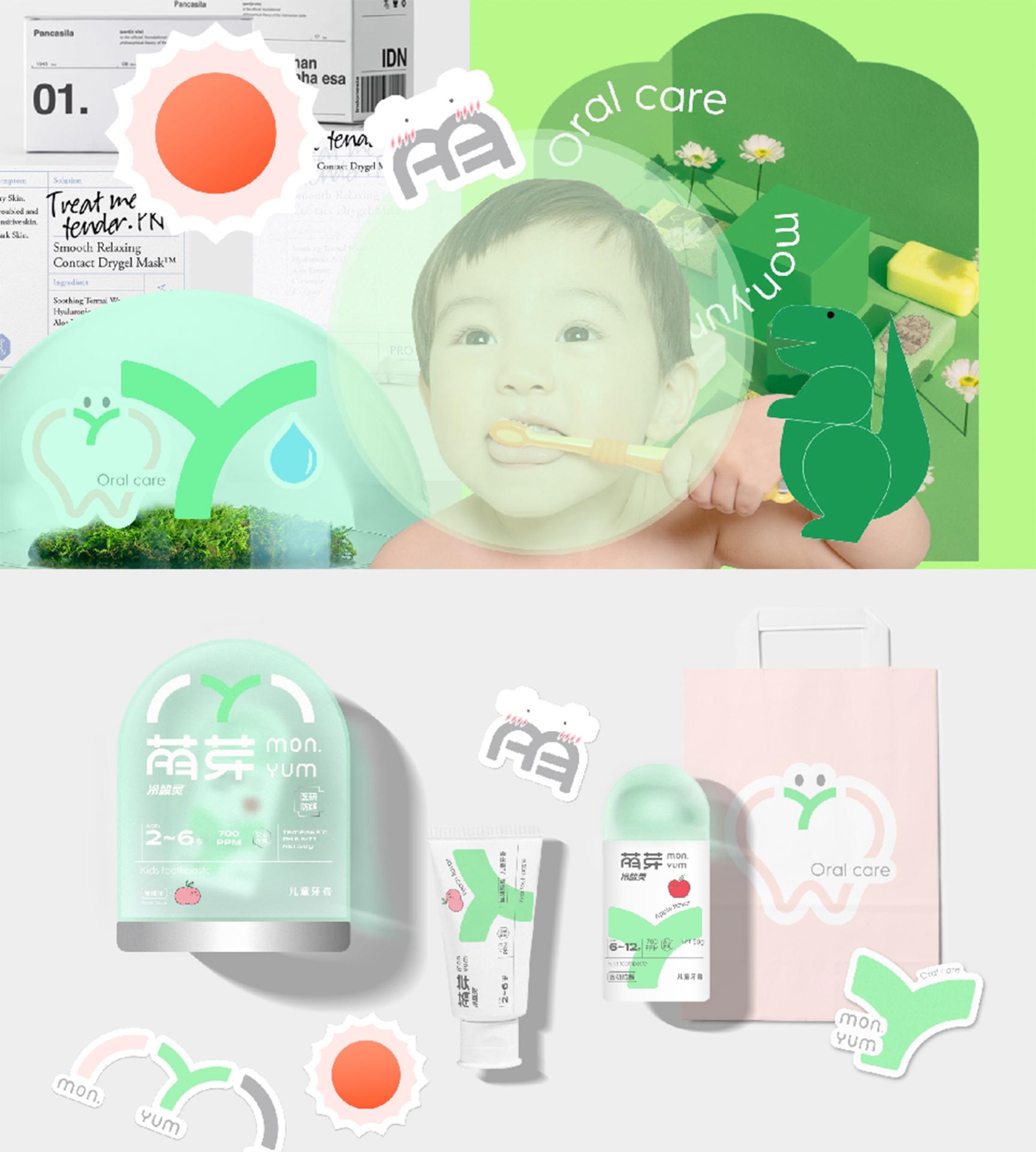
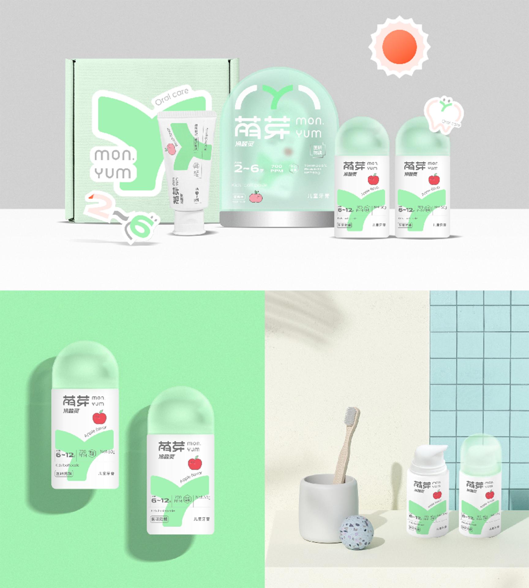
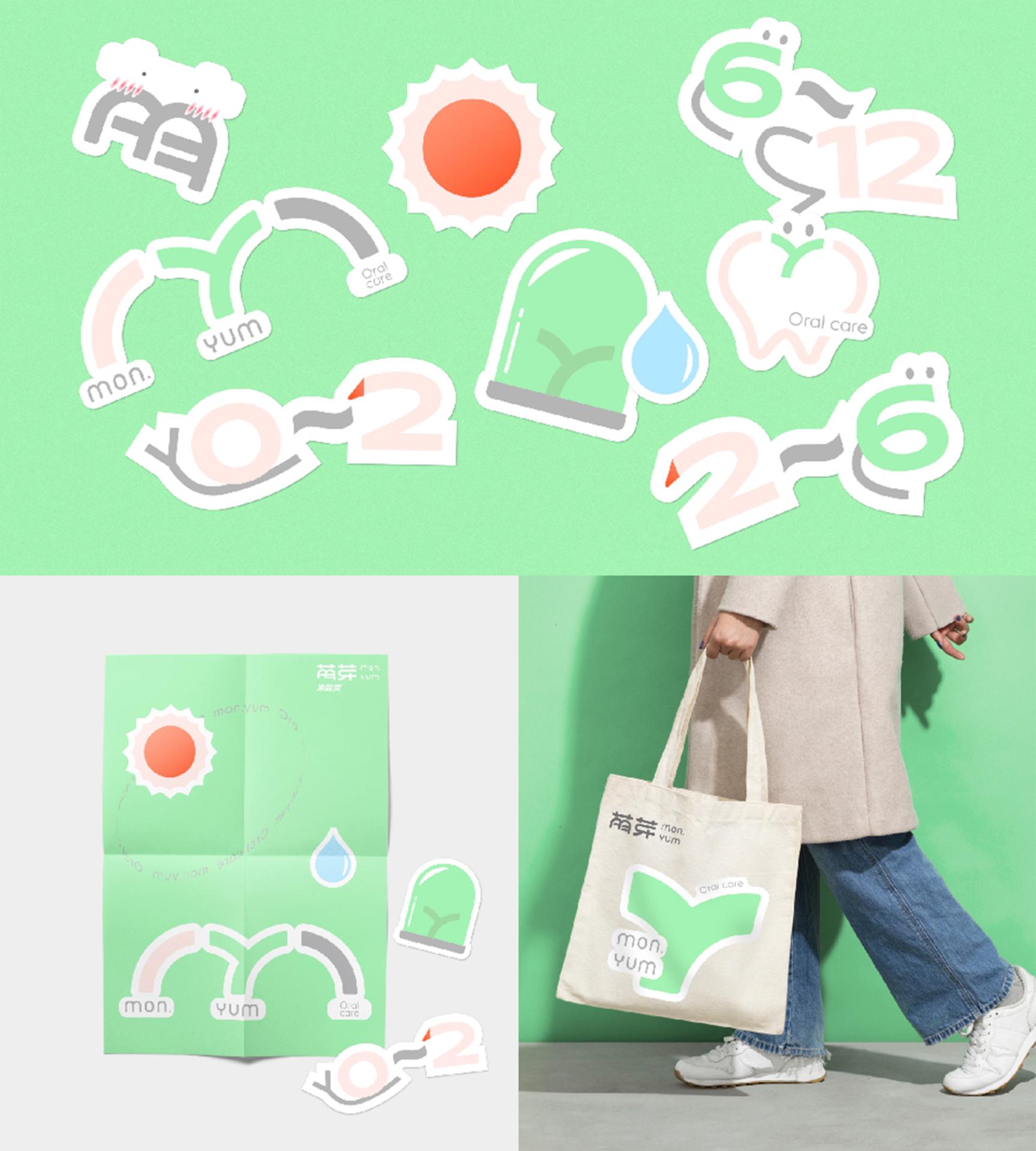
The design of the packaging is fundamentally based on the central idea of "baby teeth begin with Mengya." It incorporates the "ecological pod" concept representing technology-driven oral protection, alongside the "nursery" concept representing nurturing of infant oral health, transforming these ideas into a clear visual language. The dominant color used is a soft green, which conveys a sense of product safety and gentleness. The main visual element is encapsulated in the letter mark "MY," which is combined with the shapes of a sprout (mengya) and a tooth. This not only reflects the brand name but also embodies the mission of "caring for a child's first tooth", ensuring strong recognizability and memorability. The packaging is designed with fully rounded, translucent matte finishes, mimicking the feeling of a tooth being gently wrapped.
This complete design provides the perfect example for achieving a youthful transformation and value enhancement for traditional domestic brands.
Credits
Entrant
Gulf Health Council
Category
Video, Commercial & Film - Children
Country / Region
Saudi Arabia
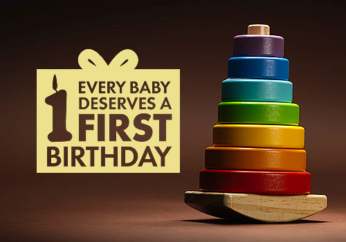
Entrant
The Focus Group, Inc.
Category
Marketing Campaign - Communications Campaign
Country / Region
United States
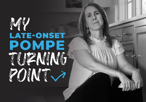
Entrant
Precision AQ
Category
Marketing Campaign - Patient Engagement
Country / Region
United States

Entrant
Exicon Group
Category
Advertising - Poster
Country / Region
India