
2026
Chong Ba Ba Cat Functional Freeze-Dried Series
Entrant
Guangzhou Jinchong Investment Co., LTD
Category
Branded Content - Retail
Client's Name
Chong Ba Ba
Country / Region
China
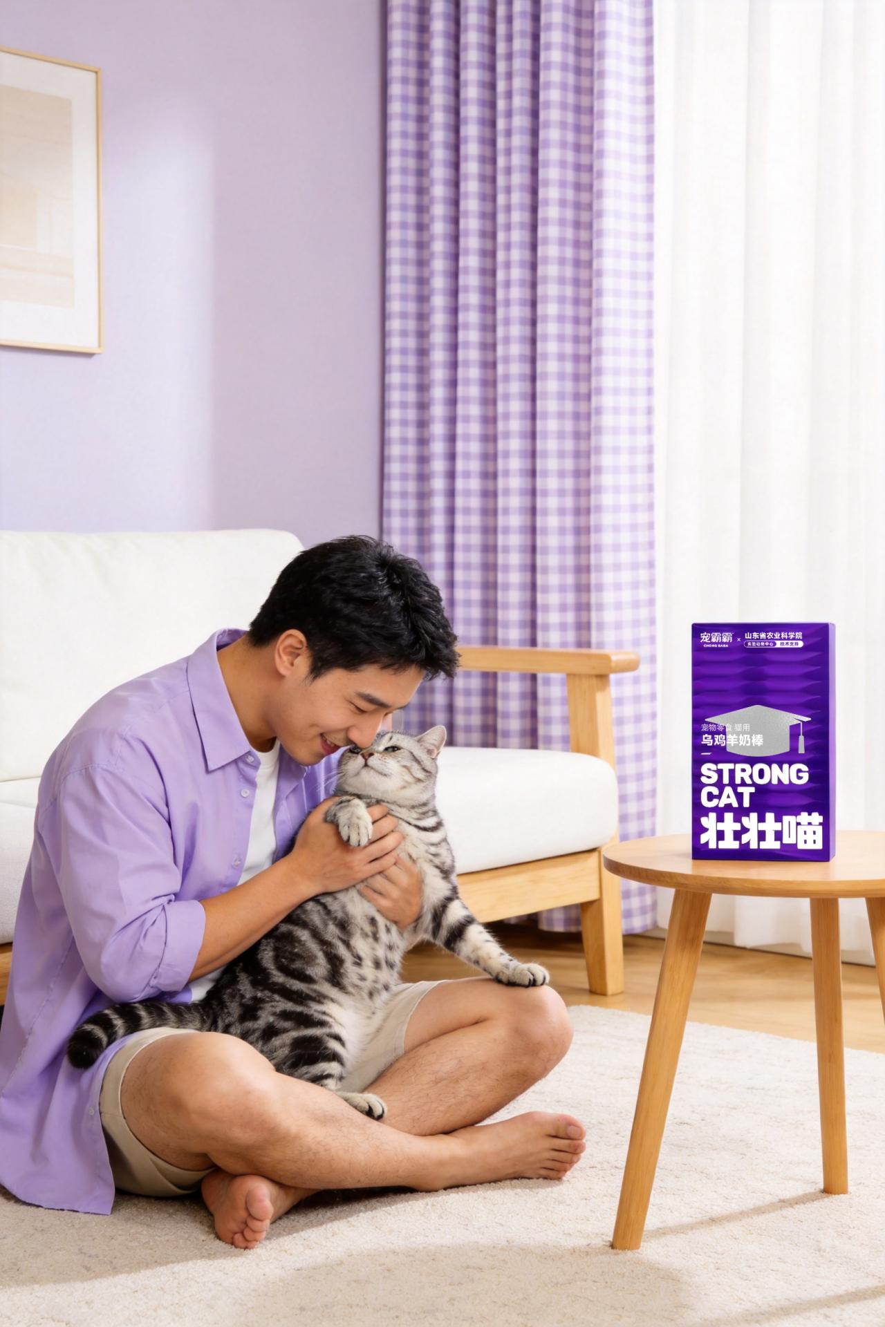
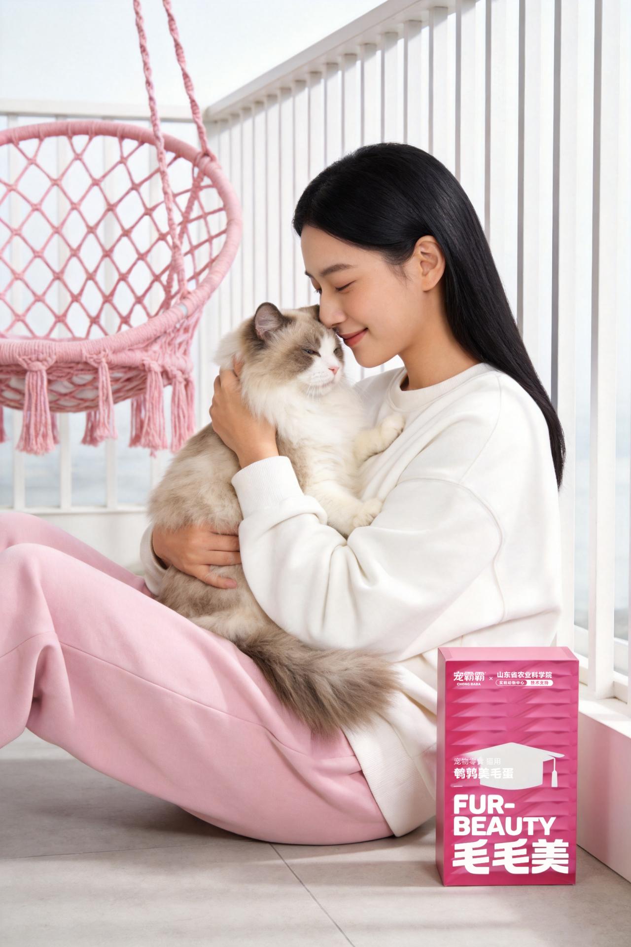
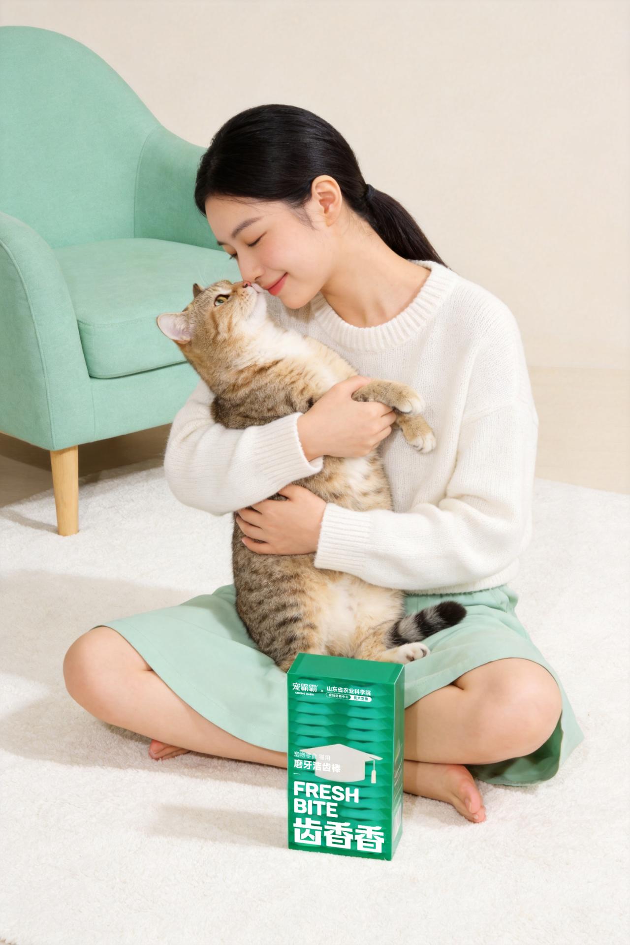
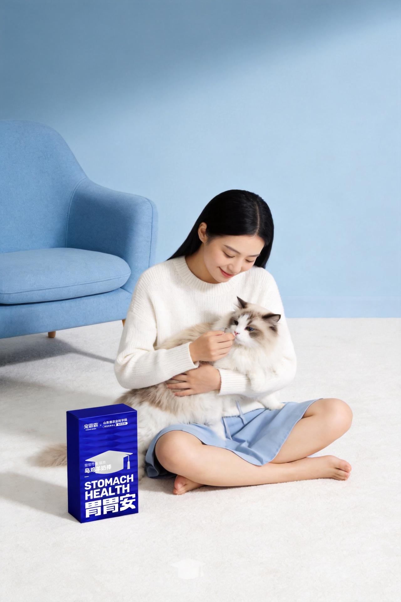
With the rapid growth of China’s pet food market, cat treat packaging has become increasingly homogeneous, making it difficult to meet Generation Z consumers’ growing demand for science-based pet care and ingredient transparency. The packaging of Chong Ba Ba Cat Functional Freeze-Dried Series breaks away from the conventional childish style of pet food packaging. By combining scientific credibility and youthful aesthetics, it makes science-based feeding transparent.
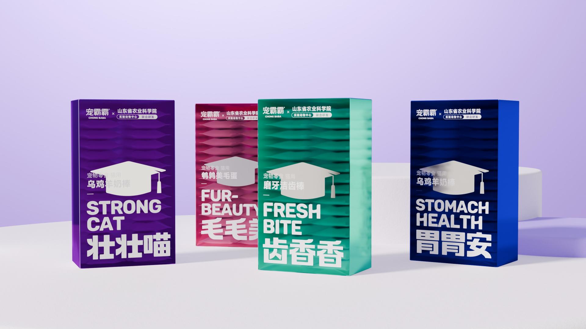
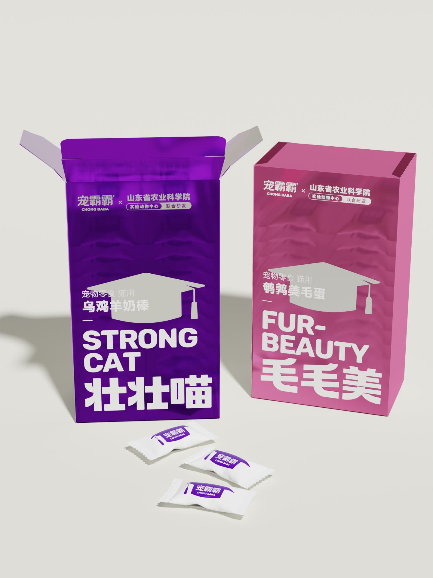
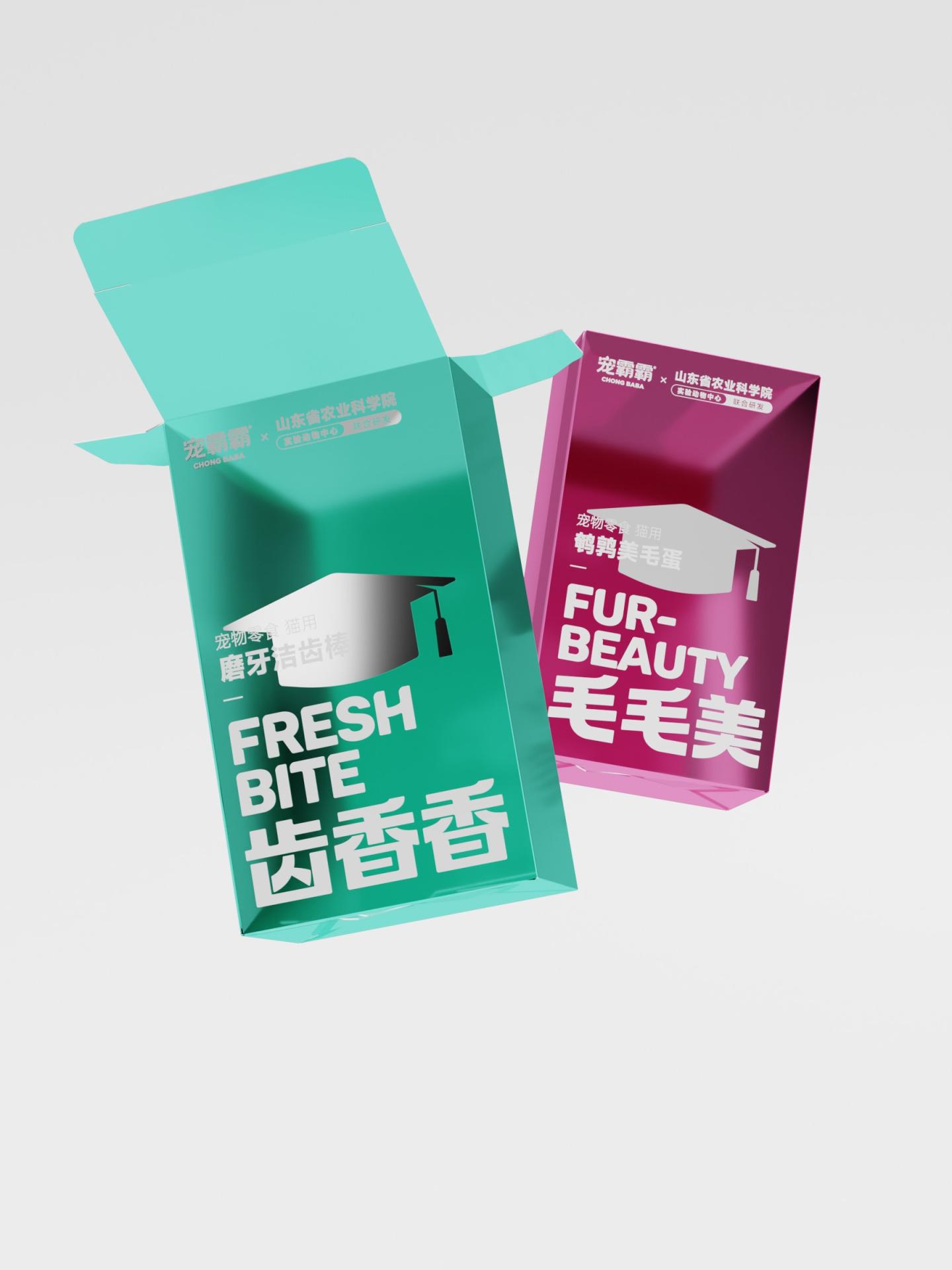
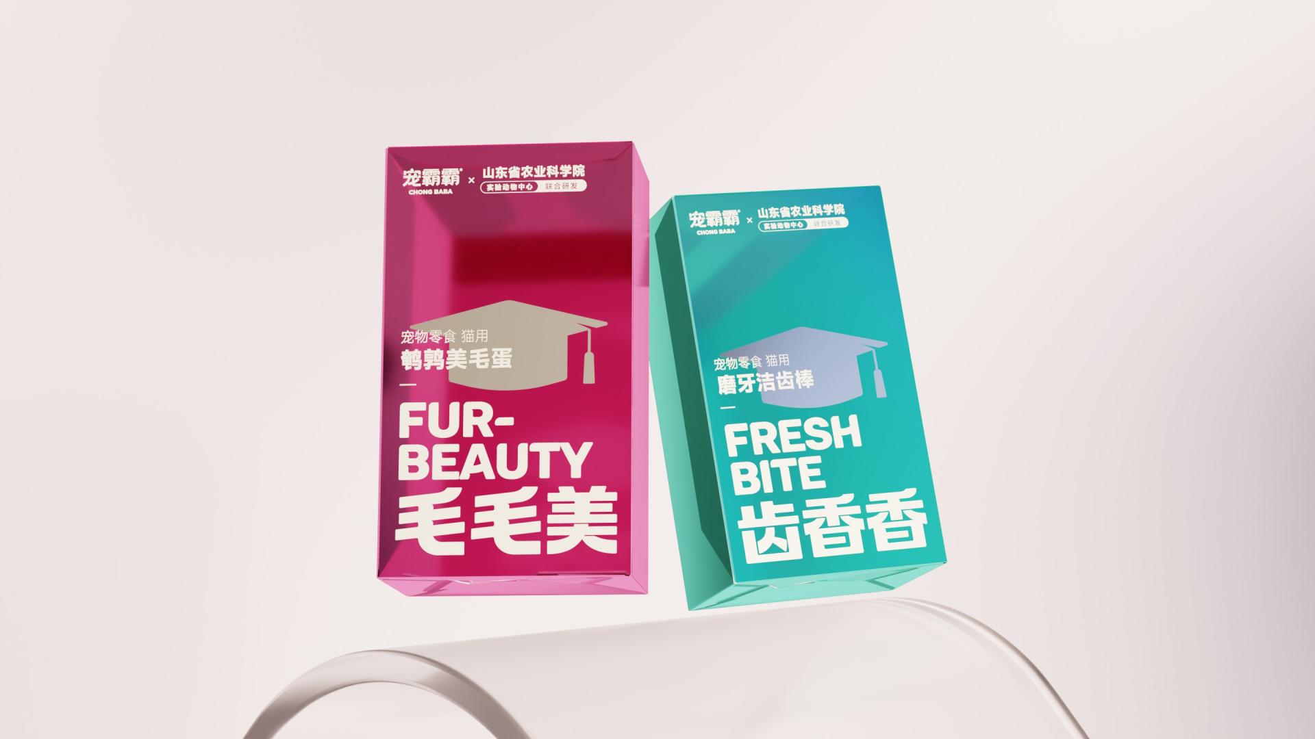
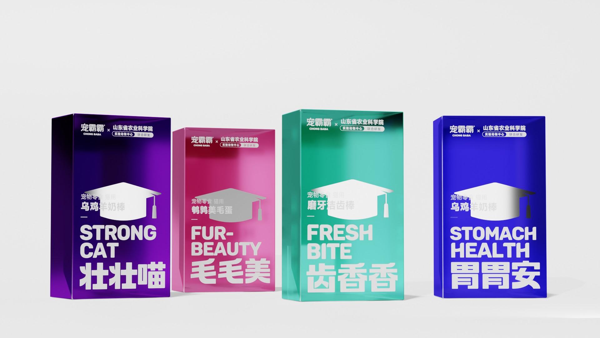
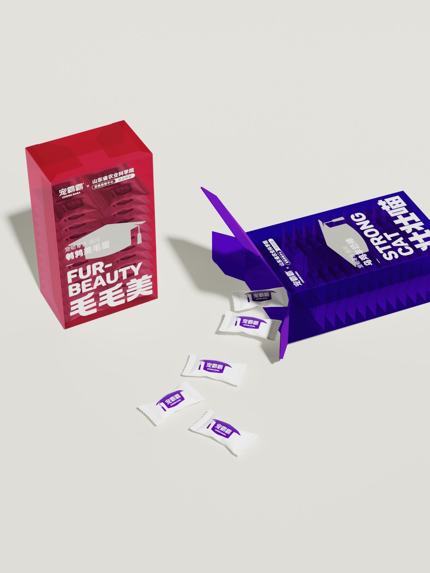
The packaging is inspired by the look of modern cosmeceutical products and laboratory containers, emphasizing cleanliness, precision, and reliability. To enable efficient shelf recognition, a color coding system is established, with each color representing a specific functional benefit: purple for STRONG CAT, improving strength and immunity; magenta for FUR BEAUTY, helping pets grow a healthy and glossy coat; teal green for FRESH BITE, providing fresh oral care; and deep blue for STOMACH HEALTH, delivering gentle digestive care. The high-saturation and high-brightness color palette enhances product differentiation, while the transparent PET functions as a “fifth color,” reinforcing the clean visual impression and enhancing trust by allowing consumers to directly see the product inside.
The redesign of visual symbols is a key innovation of the packaging. The “doctor’s cap” is established as the core brand symbol, replacing conventional pet-related elements such as paw prints. It embodies the scientific credibility supported by the Laboratory Animal Center of Shandong Academy of Agricultural Sciences, becoming a key visual identifier that communicates both product quality and research-driven expertise. The packaging adopts a vertical three-section grid layout to create a clear information hierarchy. The top section presents the brand identity and scientific credentials, establishing trust at first glance; the middle section highlights the product name and the doctor’s cap symbol as the core visual focus; and the bottom section uses large bilingual benefit statements in both Chinese and English to reinforce the product functions. This minimalist layout removes unnecessary visual elements and streamlines information communication. The uppercase sans-serif typography enhances both decorative appeal and readability, ensuring easy recognition on retail shelves and mobile platforms.
Credits
Entrant
SFC Group
Category
Advertising - Website
Country / Region
United States
Entrant
Minch Global Trade Inc.
Category
Branded Content - Healthcare & Pharma
Country / Region
United States

Entrant
Precision AQ
Category
Advertising - Logo
Country / Region
United States
Entrant
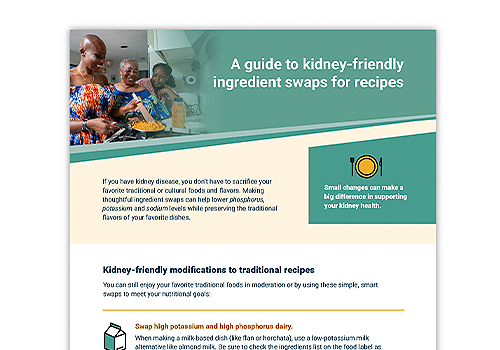
American Kidney Fund
Category
Provider & Services - Health and Fitness
Country / Region
United States