
2026
Alliwise
Entrant
Minch Global Trade Inc.
Category
Branded Content - Healthcare & Pharma
Client's Name
Country / Region
United States
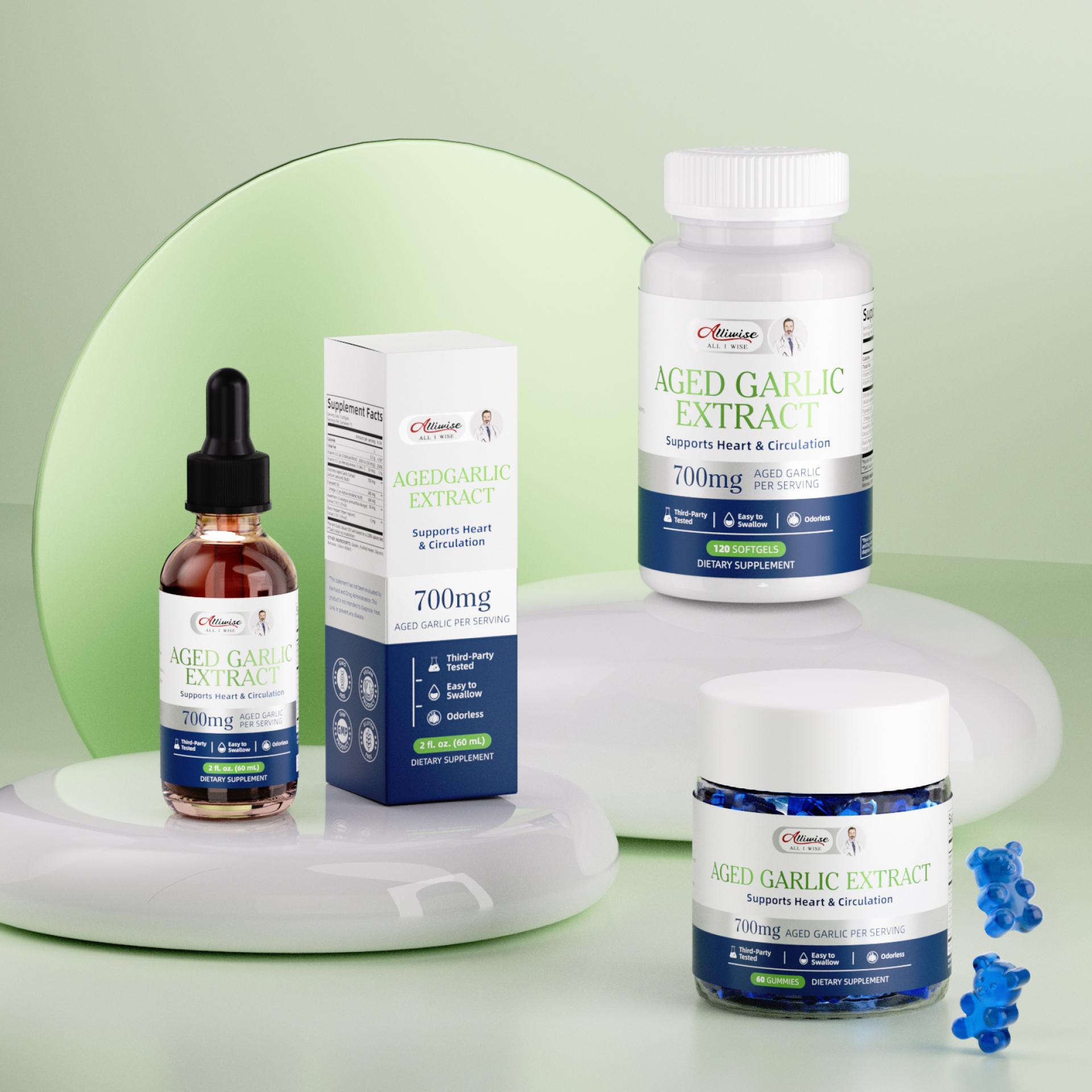
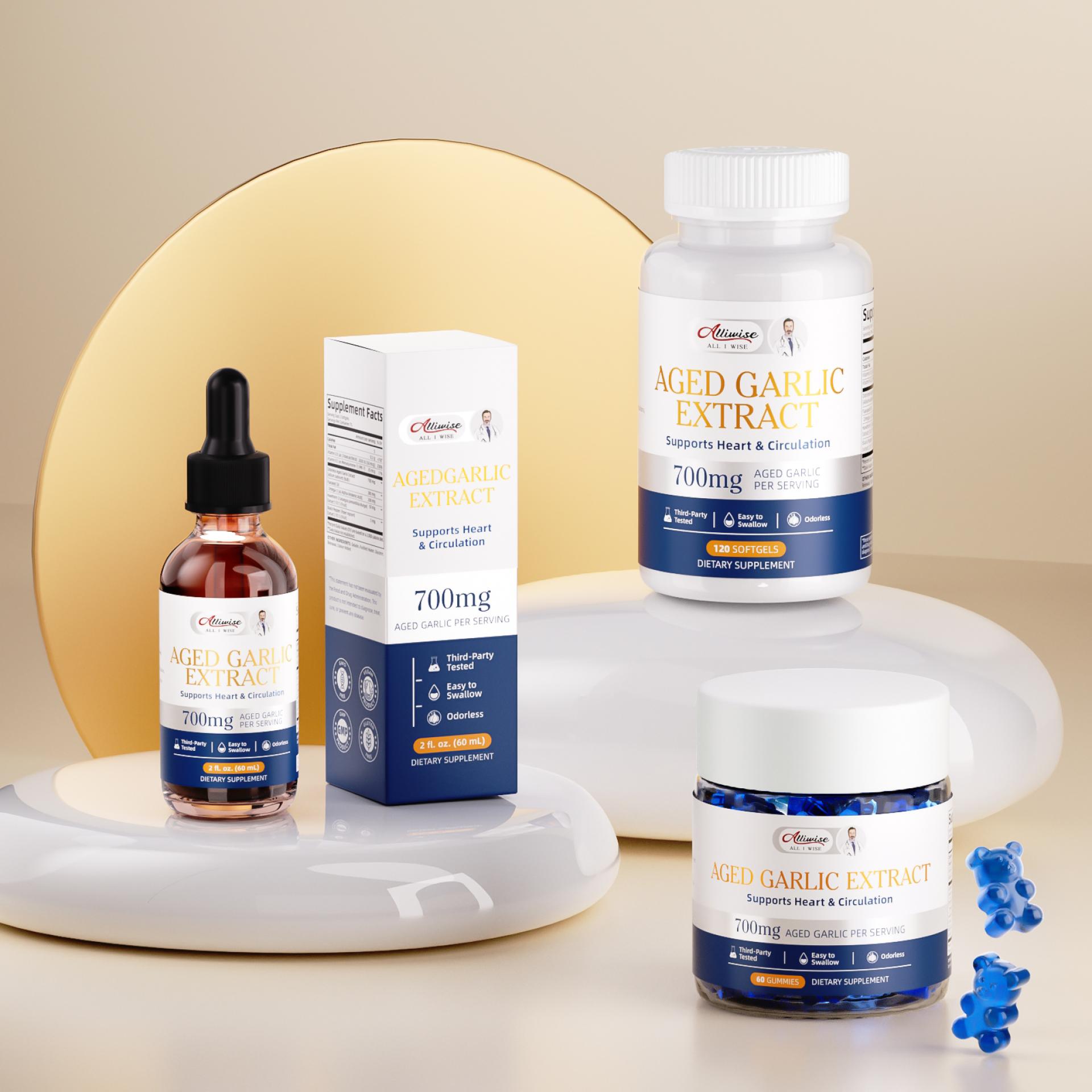
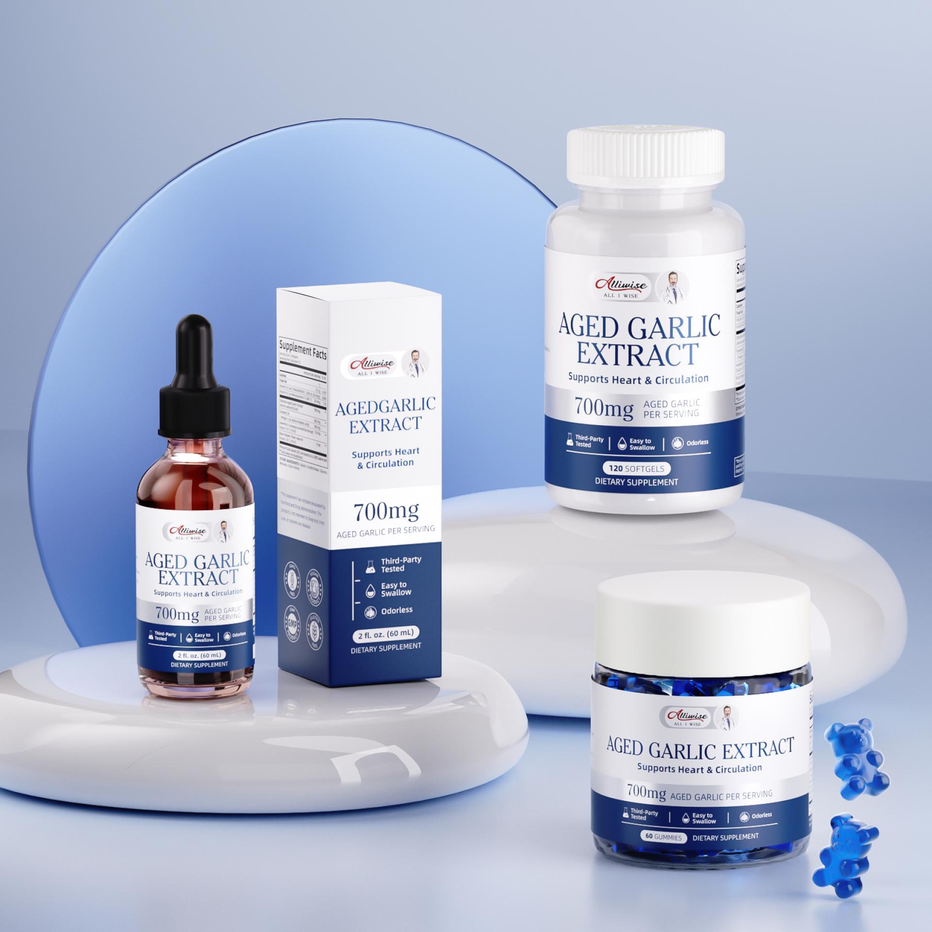
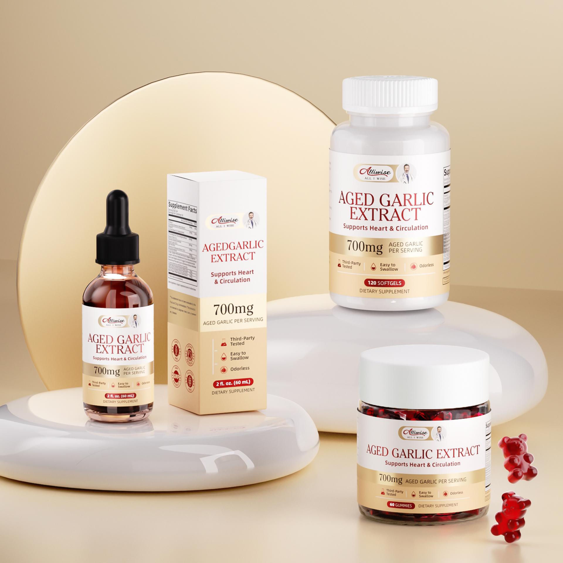
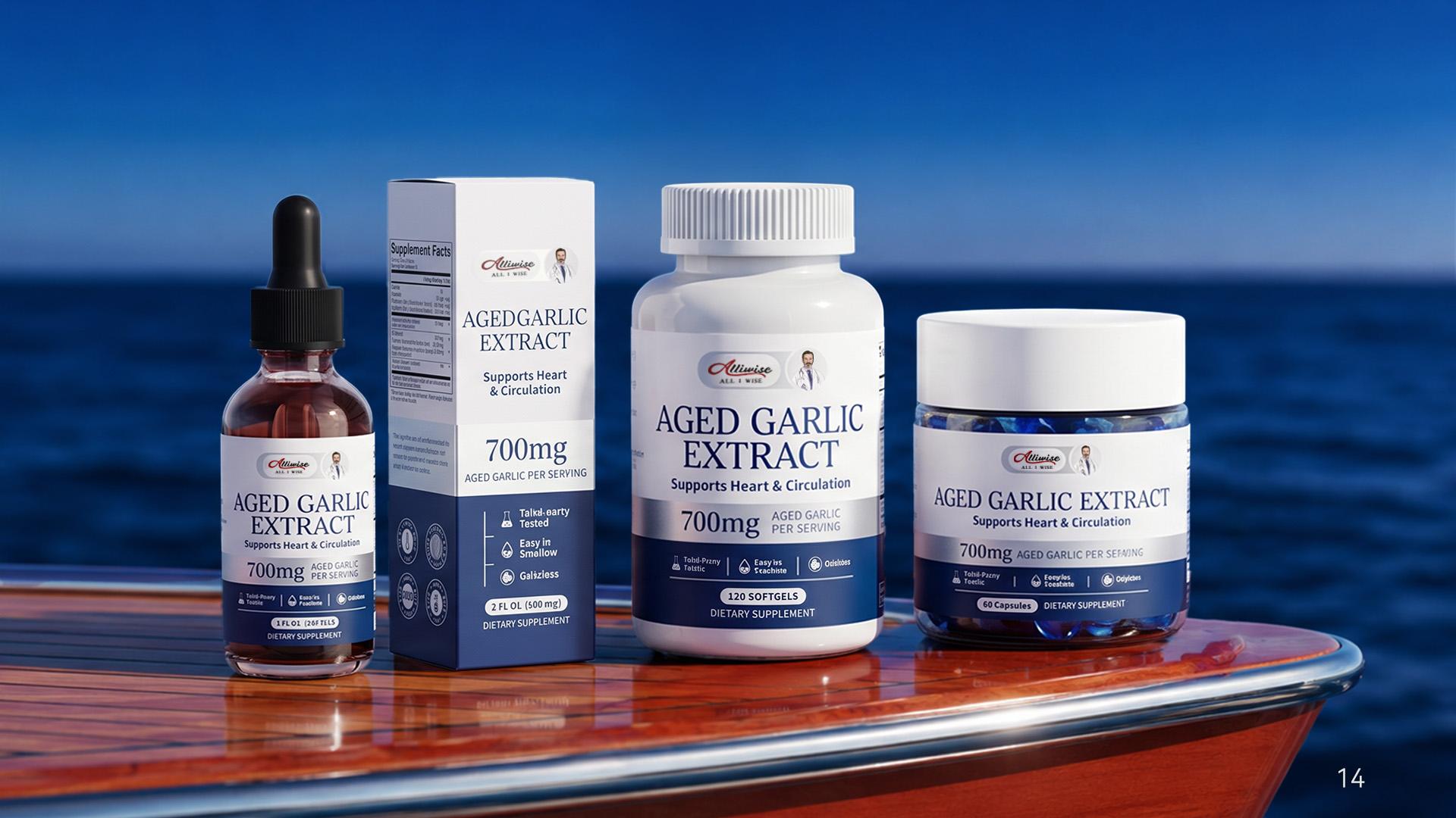
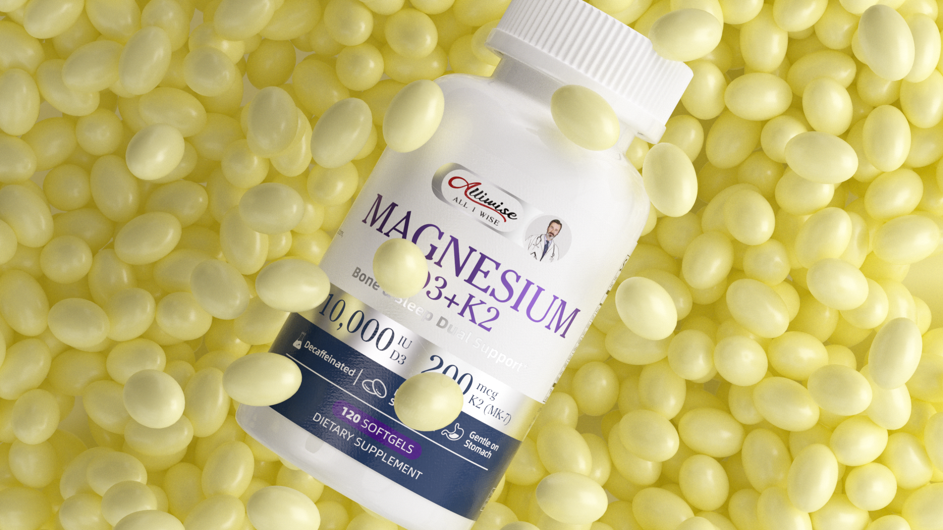
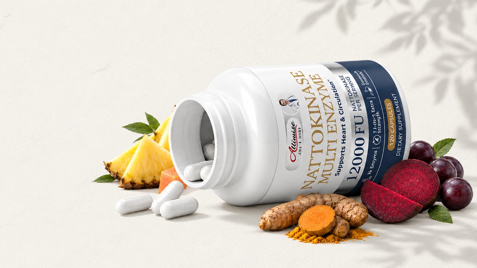
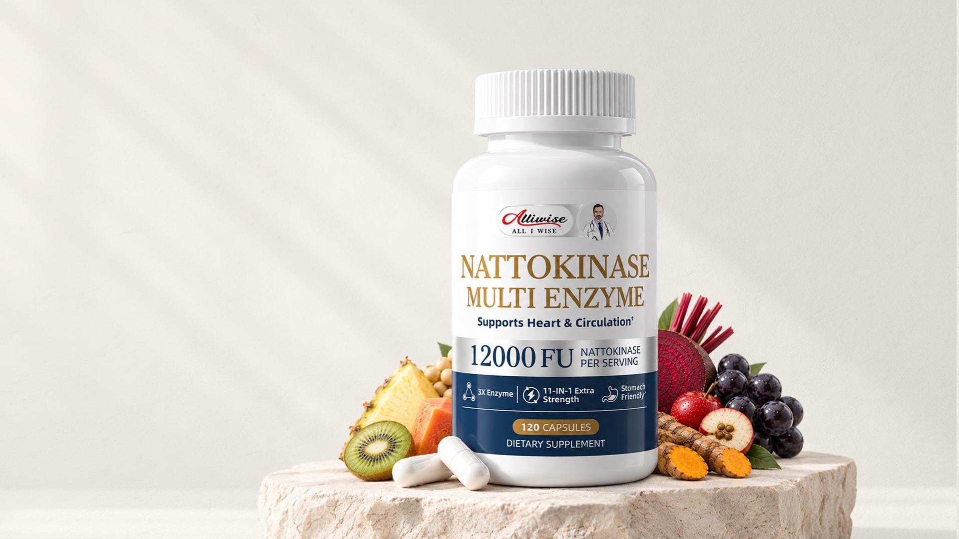
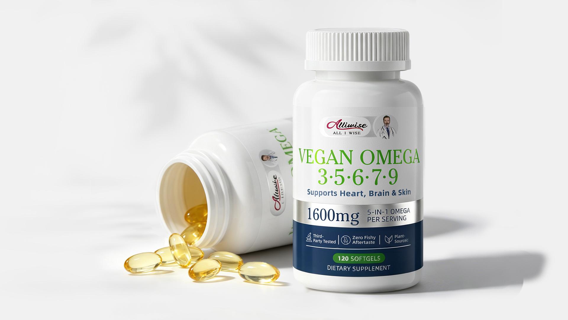
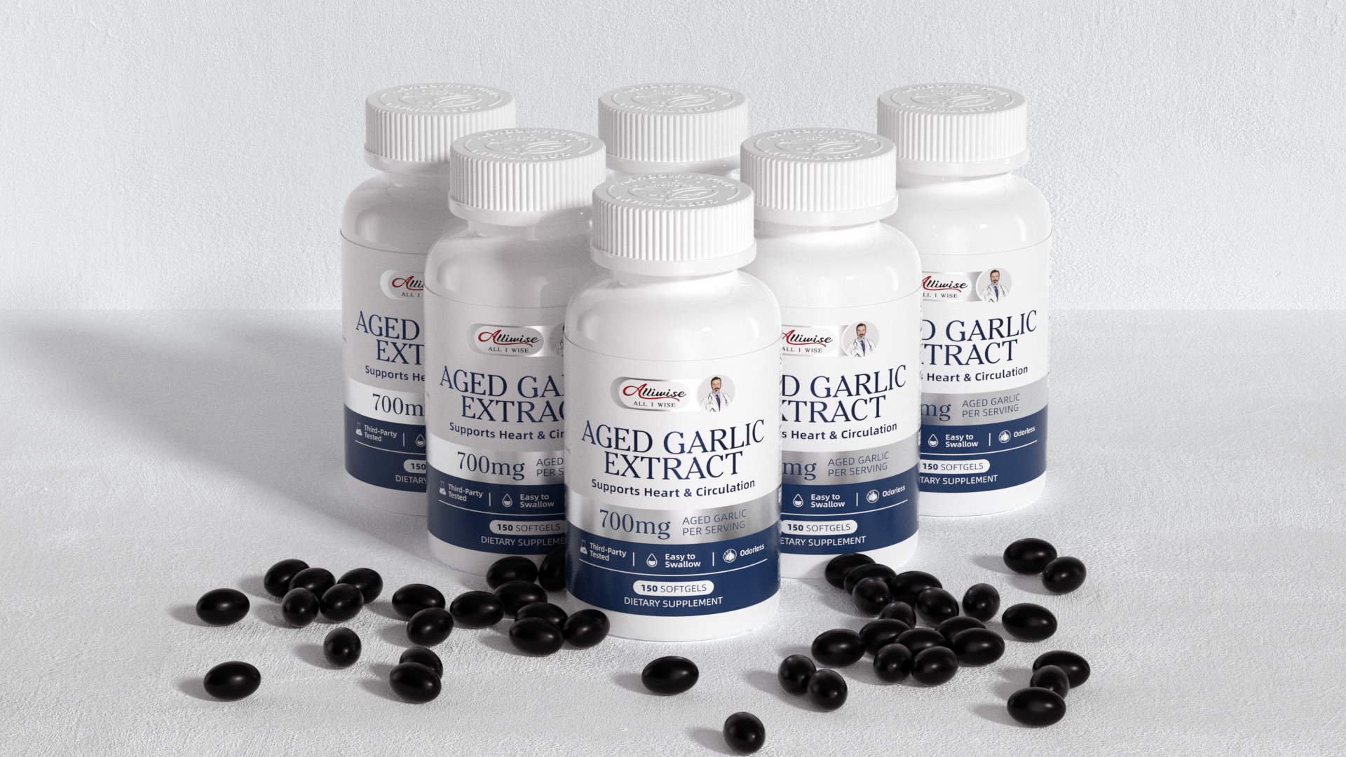
The packaging is guided by a core design philosophy of medical-grade trust and minimalist aesthetics. Moving away from the visual clutter typical of traditional health supplements, it returns to the essence of health and science. With clean color blocking and precise typographic logic, the design establishes immediate visual credibility, conveying the product's professional authority in cardiovascular health.
The color palette forms the soul of the design. Pure white dominates the visual space, evoking natural ingredients, purity, and safety — like the clean atmosphere of a laboratory. Deep blue anchors the bottom of the package, symbolizing scientific rigor and medical authority, while psychologically resonating with the product's cardiovascular benefits. Silver accents woven into the typography and dividing lines bring a sense of modern technology and premium quality, hinting at the sophistication of the extraction process. Together, the three colors create a visual system that is rational, restrained, and deeply trustworthy.
Entrant
HONG KONG OSANA INTERNATIONAL TRADELIMITED
Category
Branded Content - New Category
Country / Region
Hong Kong SAR
Entrant
Beijing Kangjin Health Management Co., Ltd.
Category
Future Innovation Design - Healthcare Design
Country / Region
China
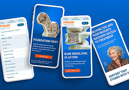
Entrant
SFC Group
Category
Advertising - Website
Country / Region
United States
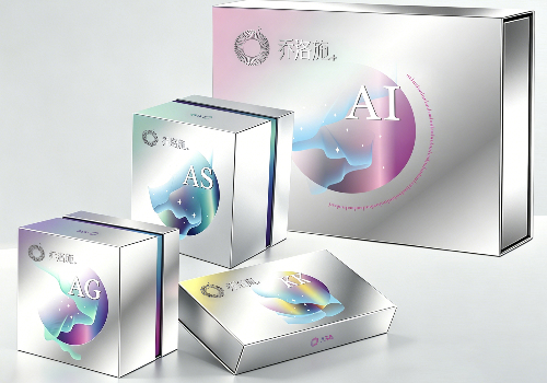
Entrant
AlE Bioscience (Guangdong) Co., LTD
Category
Branded Content - Healthcare & Pharma
Country / Region
China