
2023
navify Brand Evolution Visual Identity Elements - Logo and Pathway
Entrant
Roche
Category
Advertising - Logo
Client's Name
Roche Diagnostics
Country / Region
United States
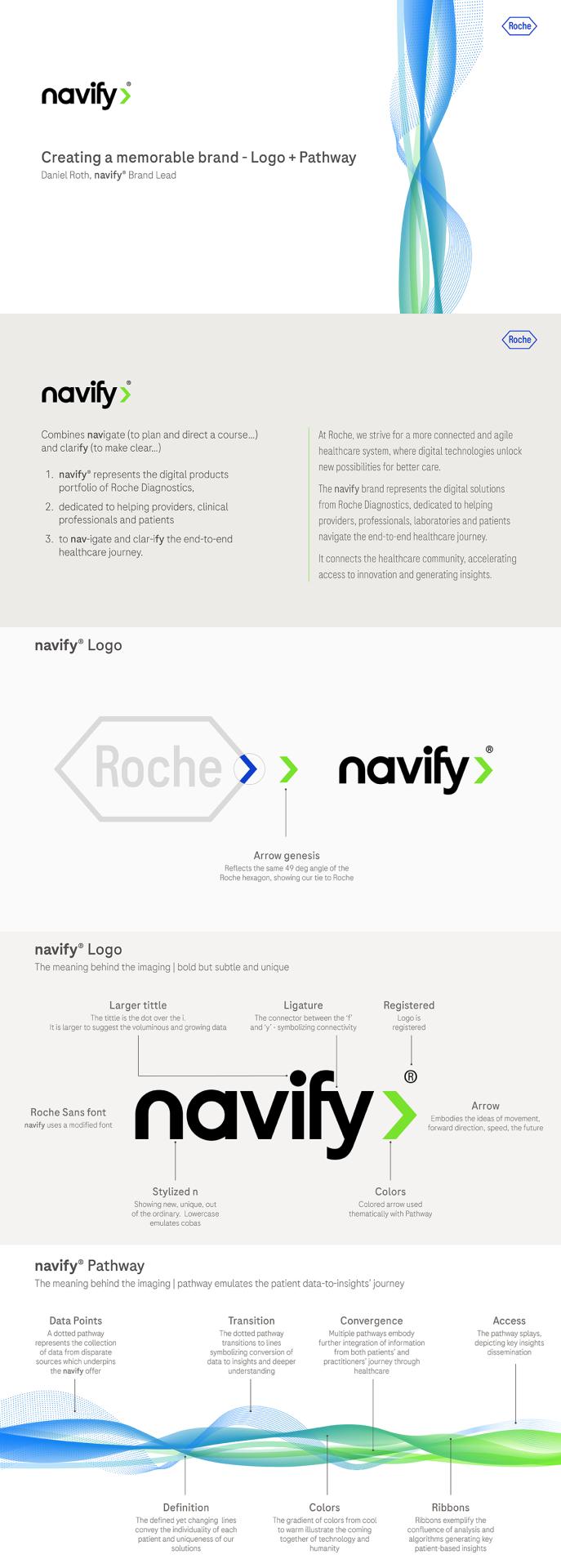
In 2021, Roche Diagnostics consolidated all digital solutions under a unified brand. navify was selected. navify, a registered trademark derived from the combination of navigate and clarify, is descriptive of the outcomes of our digital solutions.
navify is now the one digital brand of Roche Diagnostics. It has transformed the multiple digital solutions offered by Roche Diagnostics into a branded house. Foundational and visual elements for the brand are the logo and associated pathway. These elements were thoughtfully created based on the customer value propositionto support the navify Brand market presence.
The logo is at the core of the navify visual identity. It was designed to best reflect the customer value proposition to healthcare leaders. Leveraging the lower-case text of Roche brands, the navify logo was created similarly. Stylized with unique Roche Sans font, it highlights digital transformation. The enlarged tittle represents expanding patient data. The f-y ligature suggests connectivity - sharing of data. The logo’s trailing arrow, emulates the 49-deg Roche hexagon - our tie to Roche. The colored arrows match the terminus of our Pathways described below.
The Pathway is an abstract visualization of the navify value proposition, and closely tied to our logo. At left, the disparate data cluster is reflective of the voluminous patient data. Dots coalesce into lines emulating the combining of patient data, further merging into streams, symbolizing insights generated through analysis and algorithms adding contextualized meaning. Further right, following the patient journey, ribbons splay simulating information dispersion among the clinical community, enabling better patient care.
The Pathway has three gradient-based combinations symbolizing the diversity of data and patients. These theme-colored Pathways match the navify logo arrows and brand elements. The animated version is registered in multiple jurisdictions. It represents the navify process - capturing data flowing from one end to another.
All elements within the navify Brand are purposeful, supporting the brand’s value proposition, representing the insights needed throughout the patient journey.





Credits
Entrant
Freelance
Category
Advertising - Logo
Country / Region
Canada
Entrant
SFC Group
Category
Advertising - Magazine Ad
Country / Region
United States
Entrant
SFC Group
Category
Marketing Campaign - Integrated Marketing Campaign
Country / Region
United States

Entrant
Toaster Inc
Category
Experimental & Immersive - Expos, Conventions & Trade Shows
Country / Region
United States