Interview
Samraddhi Shrotriya
United States
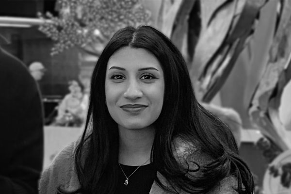
Samraddhi Shrotriya is a graphic and product designer whose work explores how visual identity can shift perspectives, using thoughtful design to challenge stigma and create more meaningful health communication.
1 Please provide us a brief bio of yourself and your health industry background.
I'm Samraddhi Shrotriya, a graphic and product designer based in Las Vegas, Nevada, specializing in brand identity systems and visual communication for technology companies and early-stage ventures. I hold a Master of Arts in Graphic Design from the Academy of Art University in San Francisco and a Bachelor of Arts from the University of Lancaster in the UK. My work in the health space is driven by the belief that visual language can either reinforce stigma or challenge it, and that good design has a responsibility to do the latter.
2 What motivated you to pursue this particular health initiative, and what impact has it had on individuals or communities?
Most sexual health communication is designed to minimize discomfort rather than foster meaningful connection. The visual language of the field—clinical whites, anonymous typography, and cautious messaging—often suggests that sexual health is something to be addressed quietly rather than discussed openly. Safe S3X 4U was inspired by the belief that a different visual approach could reshape how young women engage with sexual health. The project challenges that convention by presenting sexual health as an act of self-respect rather than a medical obligation.
3 Tell us more about your business/company, your job profile, and the specific responsibilities you undertake.
I work as a graphic and product designer at Discreet Vision LLC, a technology and security solutions company based in the United States, where I lead visual identity and product design across multiple platforms and ventures. My responsibilities span brand systems, UI/UX design, web design, and marketing collateral. Safe S3X 4U is a self-initiated project created outside of my role at Discreet Vision, reflecting my personal commitment to using design to address underserved audiences.
4 Can you share a specific story or testimonial that exemplifies the positive impact your project has had on an individual or community?
Safe S3X 4U has not yet been commercially launched, as it was created as a self-initiated brand identity project. However, it has received industry recognition that affirms its message and approach, earning recognition from one of the most established design award programs in the United States for its efforts to challenge stigma through design. The accompanying editorial feature also highlighted the project's fresh approach to rethinking the visual language of public health communication.
5 What inspired you to create this health-related creative project, and what message or impact were you aiming to convey?
The inspiration came from researching how existing sexual health campaigns communicate with their audiences. Much of the visual language in the space is designed to minimize discomfort rather than create meaningful connection. Through every design decision, many of these campaigns unintentionally suggest that sexual health is something to be approached quietly. This project began with a simple question: what would this brand look like if it were designed around the people it serves rather than the institution behind it?
6 What unique artistic or creative elements did you utilize to communicate the health message or story?
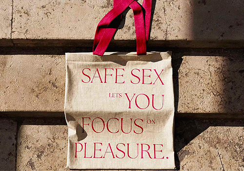
The identity draws inspiration from luxury editorial and fashion publishing rather than traditional healthcare branding. High-contrast serif typography at editorial scale conveys confidence and gives the subject the thoughtful attention it deserves, while the color palette reflects the visual language of fashion editorials. The tagline, "Safe sex lets you focus on pleasure," reframes the conversation entirely. Campaign applications, including tote bags, notebooks, and billboards, were intentionally chosen because objects carried through everyday life make a message visible in ways digital communication often cannot.
7 How does your creative project contribute to raising awareness, promoting behaviour change, or improving health outcomes?
By changing the visual register of sexual health communication from clinical to editorial, the project changes the emotional experience of engaging with the subject. When the design looks like something someone would choose to be seen with rather than something they would hide, engagement increases. The project argues that design posture is not neutral. Every typeface choice and color decision either reinforces a stigma or challenges it.
8 What unique and compelling elements did you incorporate into your advertising materials to capture attention and deliver the health message effectively?
The most distinctive element is the deliberate rejection of the category's conventional visual language. Where many campaigns rely on clinical whites and sterile typography, Safe S3X 4U embraces high-contrast editorial serif typography, warm tones, and confident, direct messaging. The campaign applications were chosen with intention. A tote bag is a public object, signaling that sexual health is a subject people can approach with confidence rather than discomfort.
9 Congratulations! As a winner of the TITAN Health Awards, what does it mean to you, your company or team to receive this award distinction?
Winning this award as an independent designer with a self-initiated project is a meaningful affirmation that the central idea behind Safe S3X 4U resonates beyond my own perspective. It reinforces my belief that sexual health communication deserves the same level of craft, intention, and thoughtful design as luxury and editorial work.
10 Can you explain a bit about the winning work you entered into the TITAN Health Awards, and why you chose to enter this project?
Safe S3X 4U is a brand identity system for sexual health communication designed for young women. It challenges the clinical visual language that has long defined the category by drawing inspiration from luxury editorial and fashion publishing, presenting sexual health as an act of self-respect rather than a medical obligation. The identity extends across typography, color, campaign applications, and billboards. I entered this award program because the project sits at the intersection of design and public health, making it the ideal platform to share its message.
11 What was the biggest challenge with this project?
The biggest challenge was the lack of existing reference points. There was no established visual language in sexual health communication that reflected what this project set out to achieve. Every creative decision had to be built from the ground up, drawing inspiration from industries such as luxury editorial and fashion, then adapting their visual language to a subject they had rarely explored. It took three iterations over two years to arrive at the final identity.
12 How has winning an Award developed your practice/career?
Winning this award has reinforced my belief that self-initiated work driven by a clear design vision can earn the same recognition as commissioned projects. It has also strengthened my conviction that some of the most meaningful design challenges are the ones the industry tends to overlook, and that those are often the projects most worth pursuing.
13 What are your top three (3) things you think is unique about the health industry?
1. Health design carries unique responsibility. A poorly designed health campaign does more than fail to communicate—it can discourage people from seeking the information or support they need. 2. The industry is evolving its visual language. Healthcare has been slower than many industries to embrace contemporary visual design, creating a gap between how health brands communicate and how people relate to their own health. 3. Stigma is also a design challenge. The visual language of health communication plays an important role in shaping how people perceive and engage with their own health experiences.
14 What makes your country unique in the health industry?
The United States has one of the world's most advanced health communication ecosystems, yet significant gaps in access and engagement remain. That contrast creates an opportunity for design to bridge the gap between healthcare institutions and the people they serve. Safe S3X 4U is one example of how human-centered design can help make that connection more approachable and meaningful.
15 Where do you see the evolution of the health industry going over the next 5-10 years?
The most significant shift will be toward design that empowers people to take an active role in their own health rather than simply receiving institutional communication. As health information becomes more accessible, the brands and campaigns that resonate most will be those that make people feel seen, respected, and understood. Visual language will play a central role in shaping that future.
16 What resources would you recommend to someone who wants to improve their skills in the health industry?
Victor Papanek's Design for the Real World shaped my understanding of design's responsibility to underserved communities. The work of designers like Paula Scher and Sagmeister & Walsh has also influenced how I think about using bold visual language to reshape the way people engage with a subject. Above all, nothing replaces direct research and listening to the lived experiences of the people you're designing for.
17 Who has inspired you in your life and why?
Victor Papanek, for arguing that the most dangerous thing a designer can do is design only for people who already have power and visibility. His argument that the most important design work happens where the gap between what exists and what is needed is largest has shaped how I choose which problems to work on.
18 What is your key to success? Any parting words of wisdom?
Design for the person, not just the brief. Every brief is written from an institutional perspective, while the people it's ultimately meant to serve are often reduced to a demographic or target audience. The gap between the brief and the person is where many designs fall short. Closing that gap—by designing around real people, their experiences, and their needs—is where I believe the most meaningful work begins.
19 Do you have anything else you would like to add to the interview?
Safe S3X 4U is more than a finished project; it's an exploration of how visual language shapes the way people experience health communication. It reflects my belief that design is never neutral, and that every creative decision influences how people feel about the subject. I hope it encourages a broader conversation about what health communication can become when it is designed around people's dignity, experiences, and needs rather than institutional convention.