
2025
The Omnidimensional Bottle
Entrant
TEENMY
Category
Branded Content - Healthcare & Pharma
Client's Name
Country / Region
China
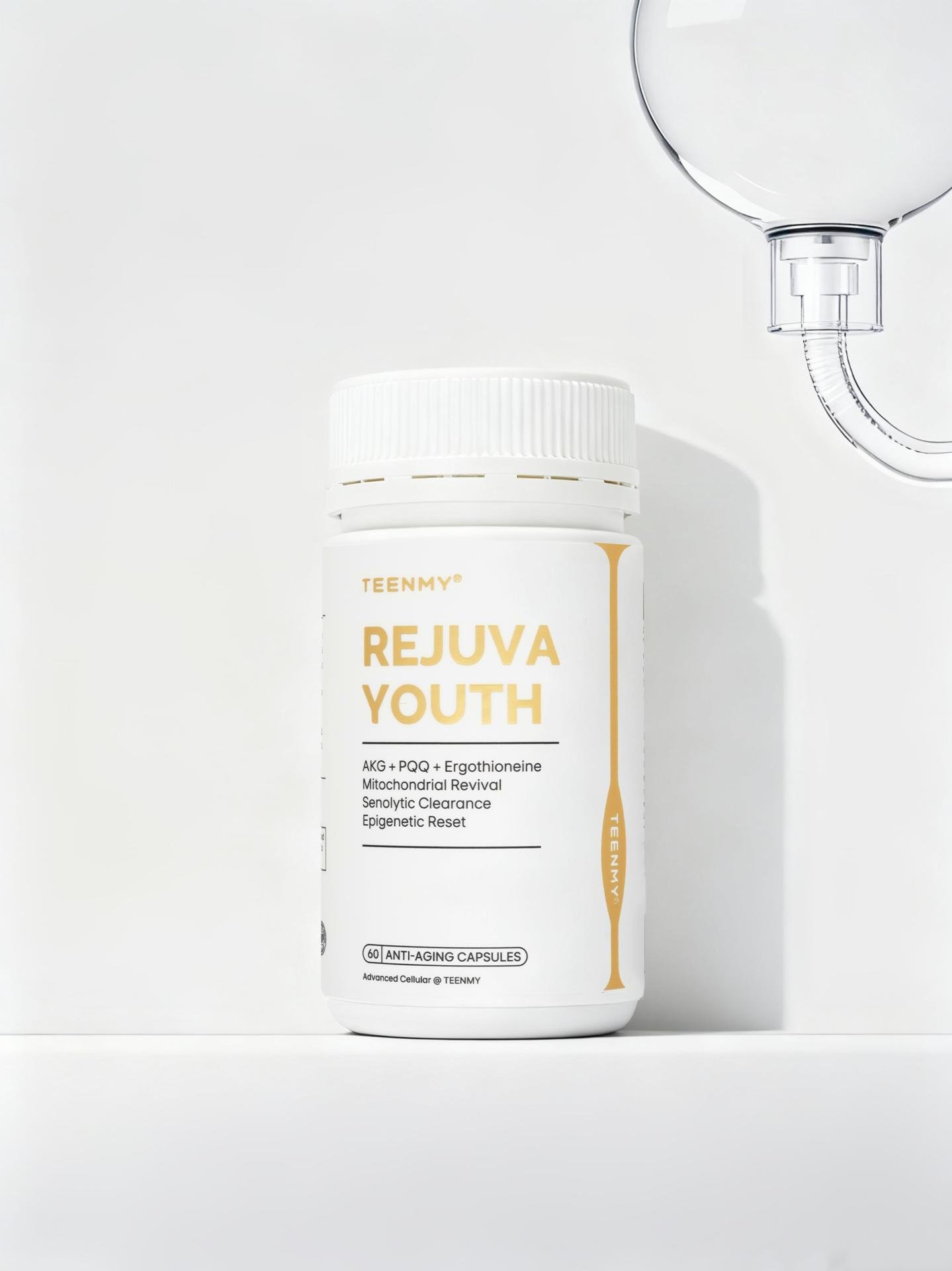
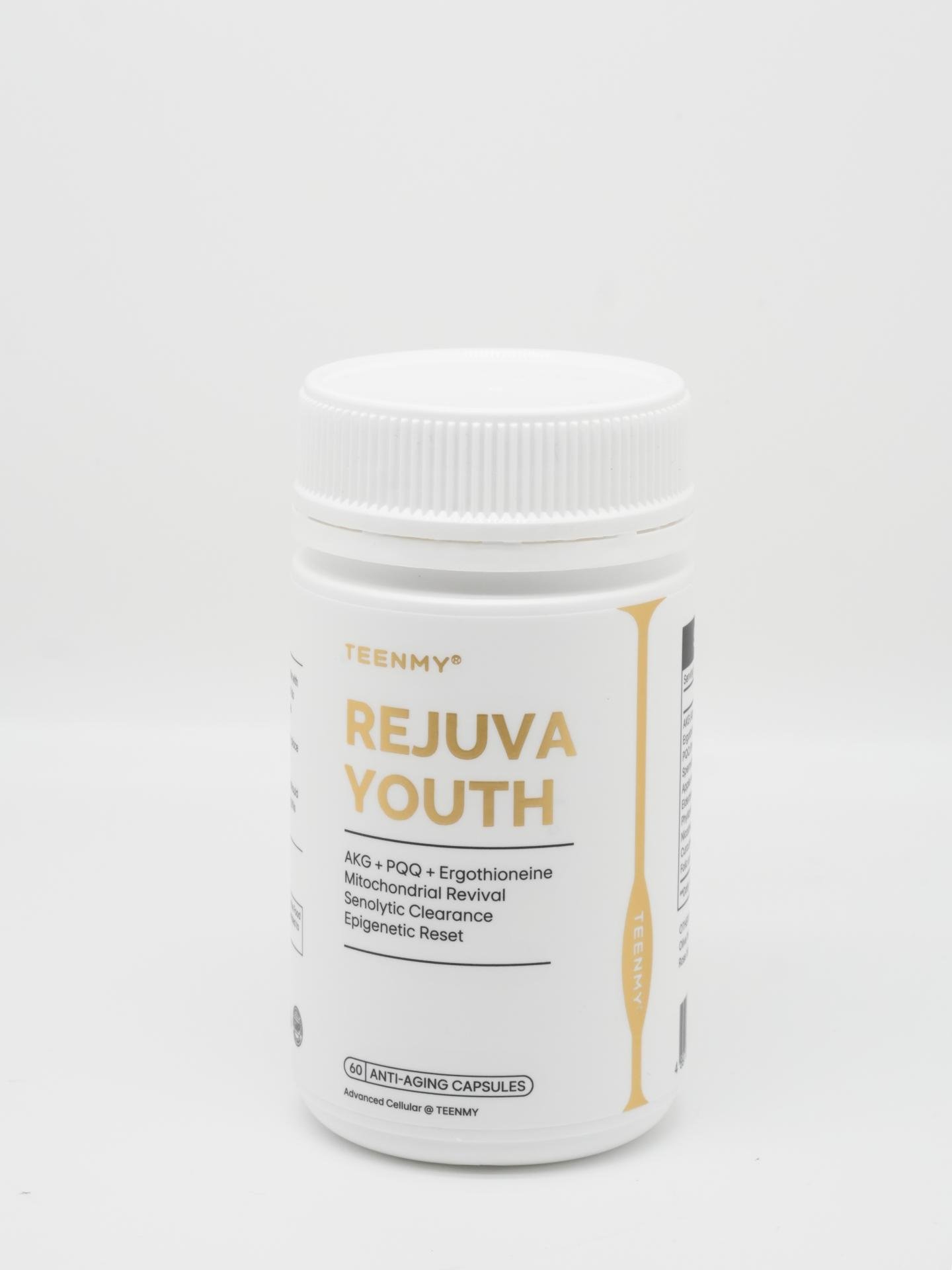
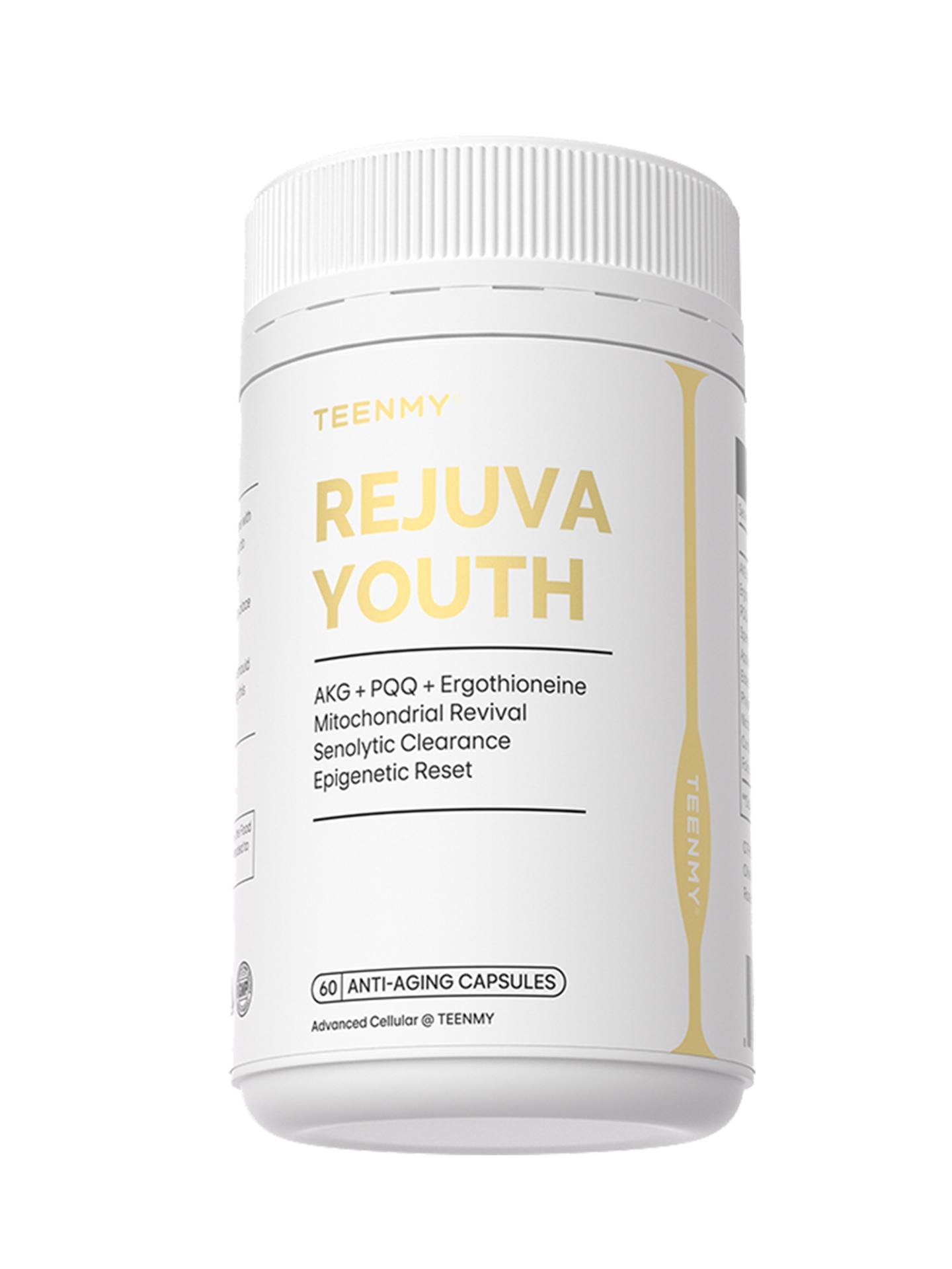
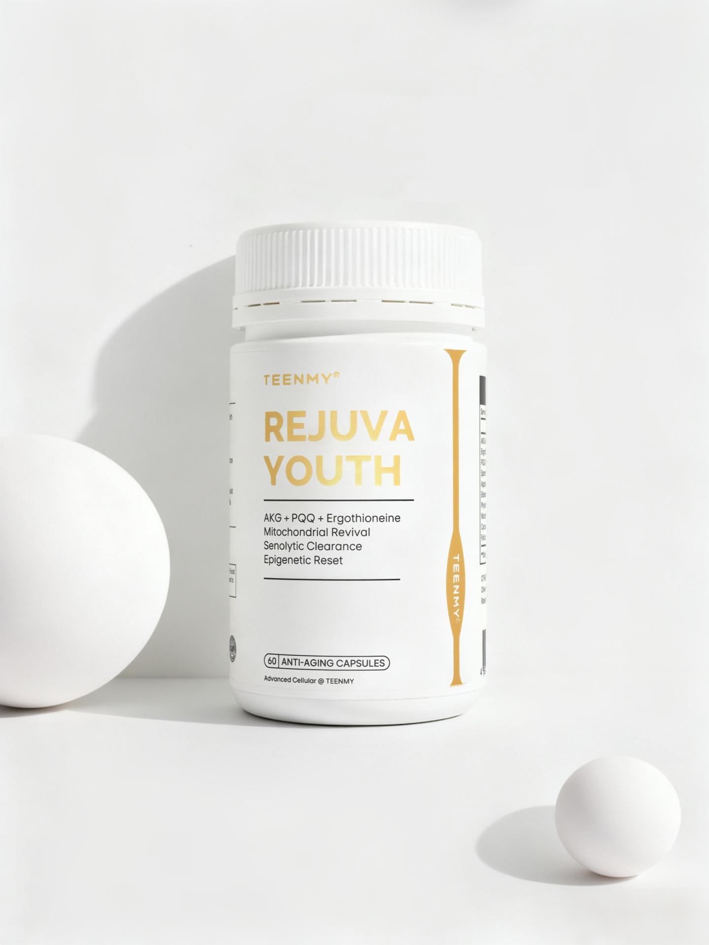
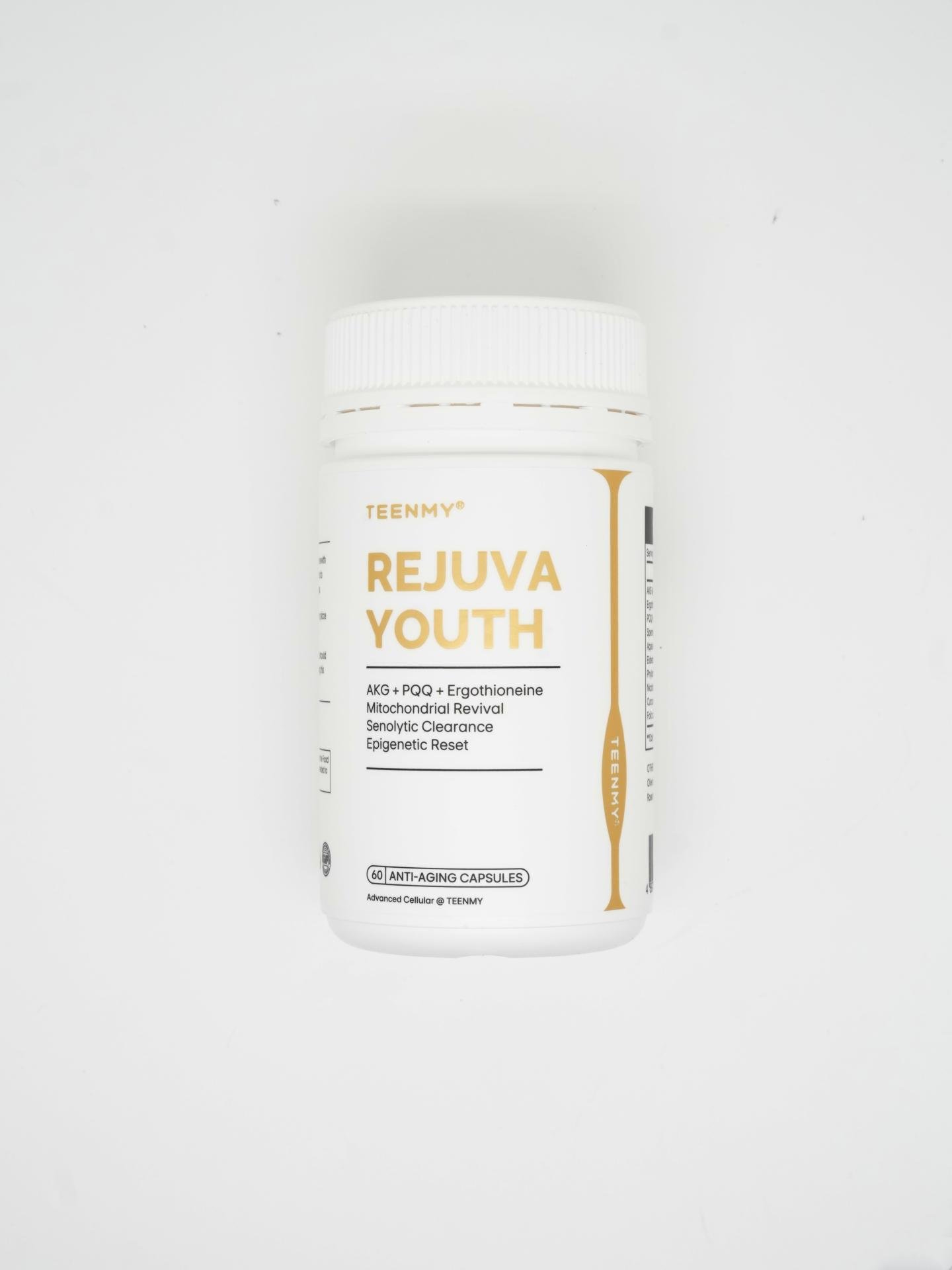
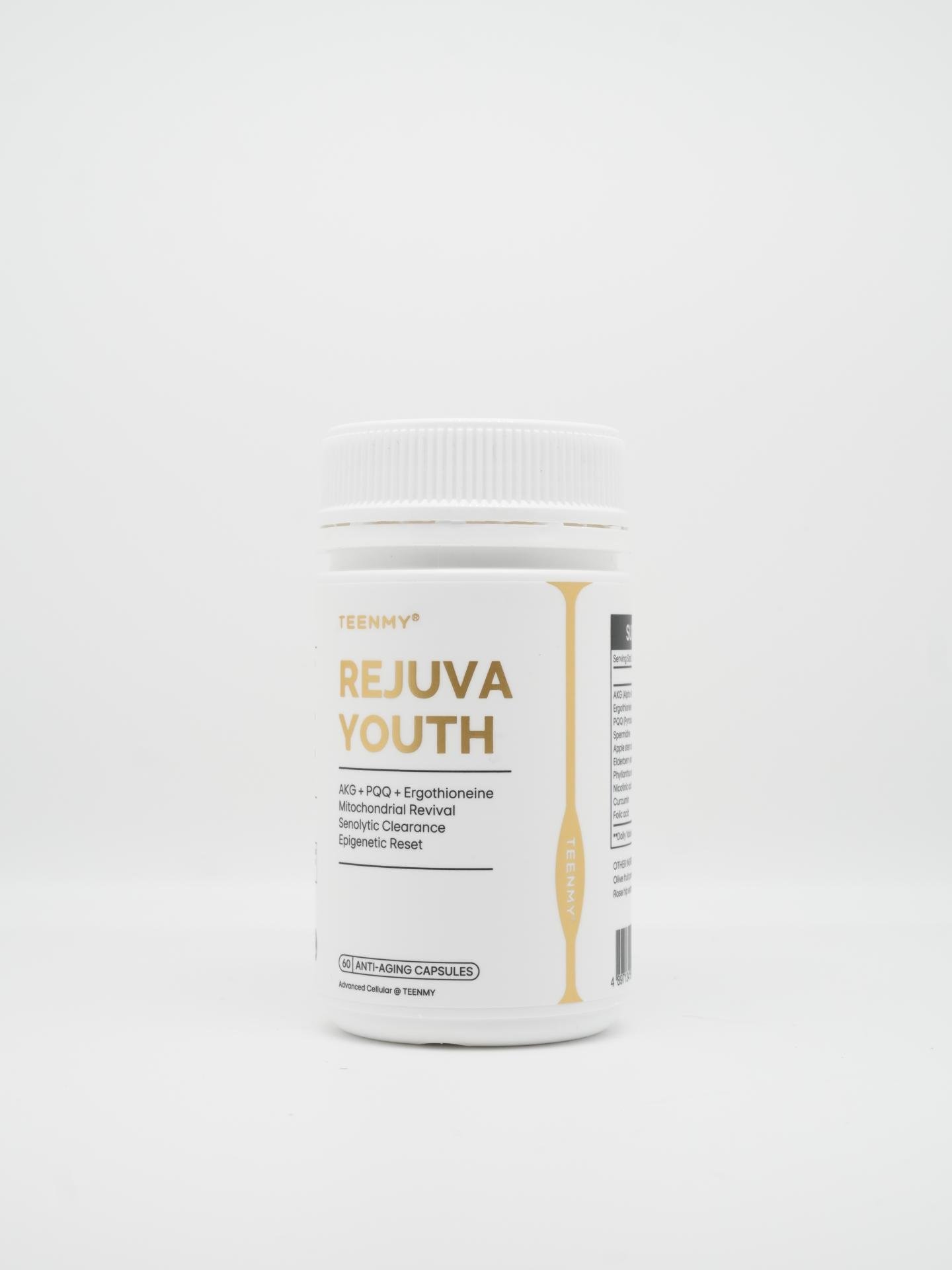
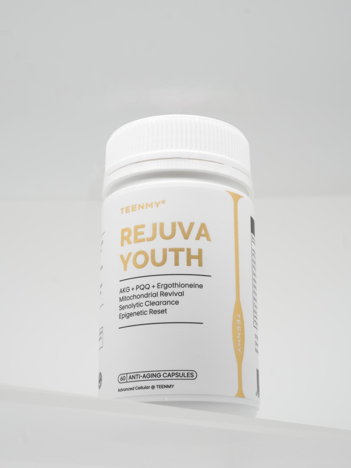
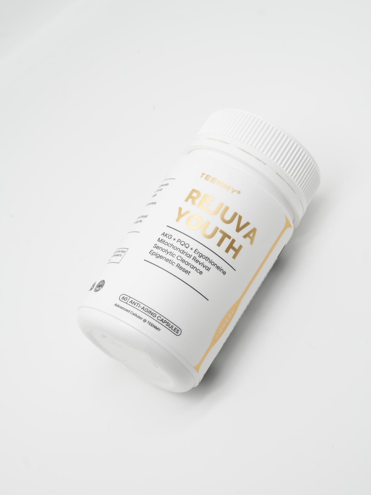
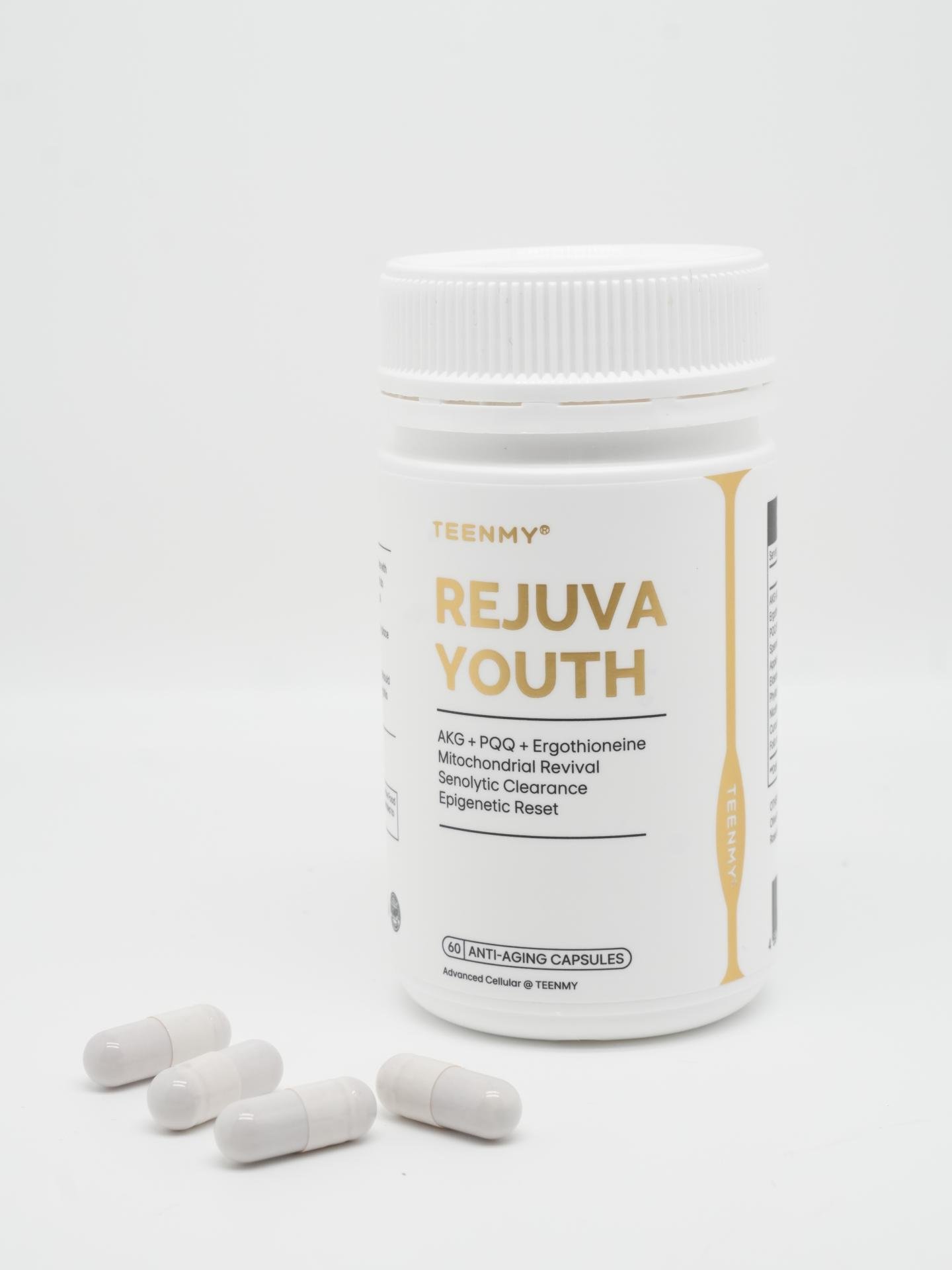
The Omnidimensional Bottle embodies a “systemic anti-aging” design philosophy, elevating the concept of anti-aging from single-ingredient solutions to a cellular omnidimensional rejuvenation system. Centered on AKG, the formula synergizes three golden anti-aging actives—ergothioneine, PQQ, and spermidine—and is complemented by 18 precisely balanced nutrients to create the proprietary “Triple Revitalization” targeted formula. The design reflects a holistic approach from genetic to functional levels, seamlessly integrating scientific rigor with healthy lifestyle principles, establishing a new benchmark for oral anti-aging.
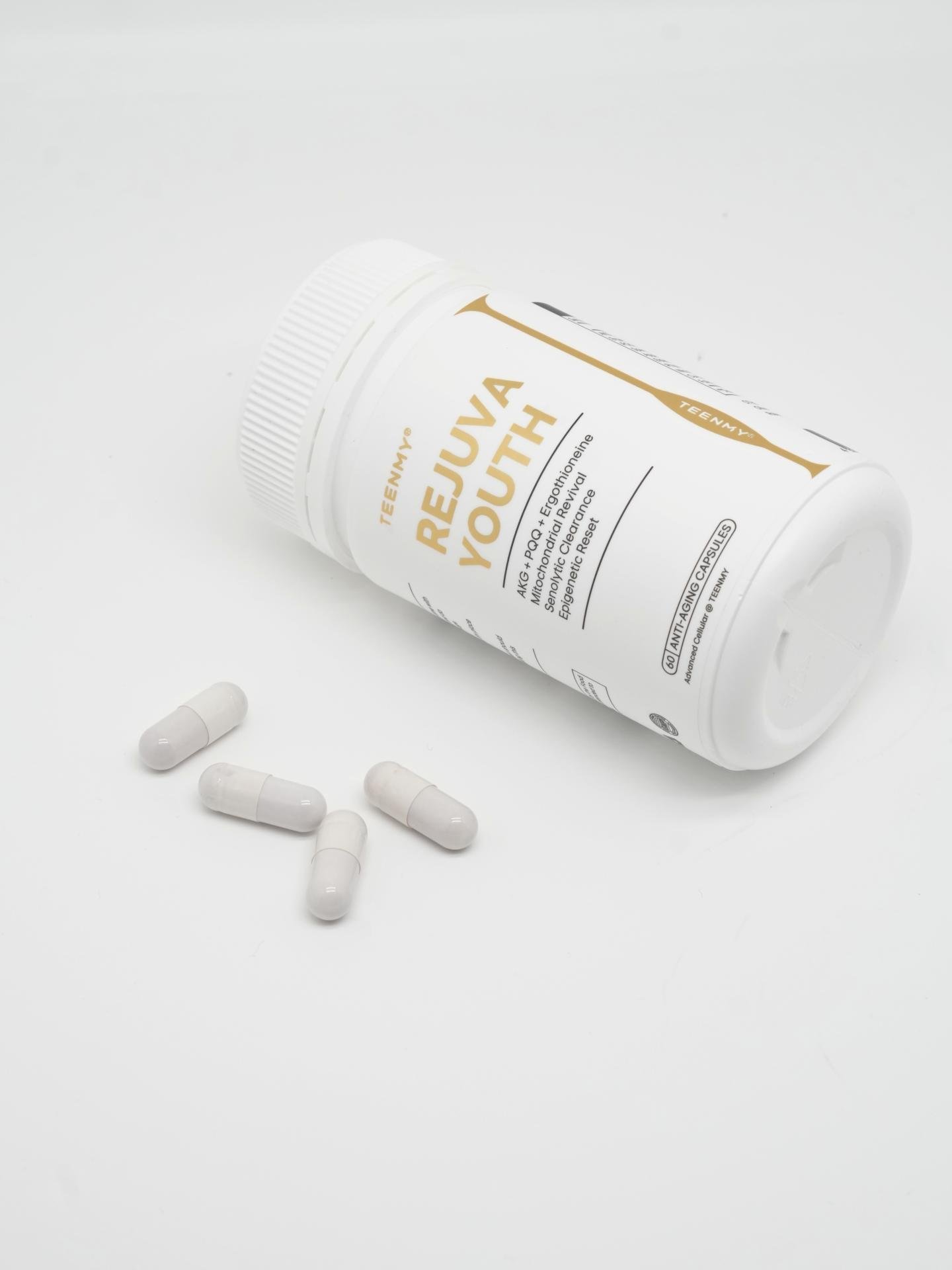
The product design prioritizes user experience, embodying the concept of “one bottle for comprehensive anti-aging.” Bottle labeling is clear, and formulation information is straightforward and easy to understand for users of different ages. The precise single-dose design and portability meet the needs of modern fast-paced lifestyles. Safety and usability are carefully considered, allowing consumers to experience both scientific effectiveness and thoughtful care, thereby enhancing brand trust and approachability.
The Omnidimensional Bottle introduces an innovative cellular omnidimensional rejuvenation system, surpassing the limitations of traditional oral anti-aging products that rely on single active ingredients. AKG, as the core “age-reversal key,” works synergistically with the three golden anti-aging components to deliver multidimensional efficacy. The formulation has been validated through precise scientific experimentation, ensuring optimized nutrient synergy, absorption, and effectiveness. The innovation lies not only in the ingredient combination but also in the systematic approach and the scientific implementation of holistic anti-aging effects.
The bottle features a minimalist, modern design with smooth lines that convey technological sophistication and premium quality. The color palette uses low-saturation, natural, and soft tones to reinforce a healthy and pure visual impression. The packaging balances information clarity with aesthetics, enhancing product recognition while ensuring safety and convenience. The overall design creates a unified visual language, enabling the product to stand out in the cosmetic and health supplement markets and reflecting the brand’s professionalism and systematic value.
Credits

Entrant
Ebony House Inc
Category
Achievement of the Year - Healthcare Leadership Awards of the Year
Country / Region
United States
Entrant
10 to 1 Public Relations
Category
Technology Solutions - Operation Management Solution
Country / Region
United States

Entrant
Inflow Space Design Ltd
Category
Interior Design - Therapy Center
Country / Region
Taiwan
Entrant
SANAME - Performance & Immunity Multi-Collagens, Bone Broths & Soups
Category
Provider & Services - Healthcare
Country / Region
Australia